Ep. 46: Nausicaa of the Valley of the Wind Volume 1 (Editor’s Choice Edition), by Hayao Miyazaki
This week the gang talks about Studio Ghibli big-boss Hayao Miyazaki, and his classic 1982 manga Nausicaä of the Valley of the Wind! A bonafide among bonafides, but does this manga meet Chip and the gang’s strict desires for classic manga? And is it really even manga at all? Find out this episode! PLUS: Will there be a NorthAmericanComicsplaining?
Powered by RedCircle
IN THIS EPISODE
00:00 Nausicaä of the Valley of the Wind Vol. 1, by Hayao Miyazaki
52:30 The Break!
53:00 Reader Q&A: Will there be a NorthAmericanComicsplaining?
59:00 Shout-outs: Wrestle, Love, Eat (responsibly), Decorate

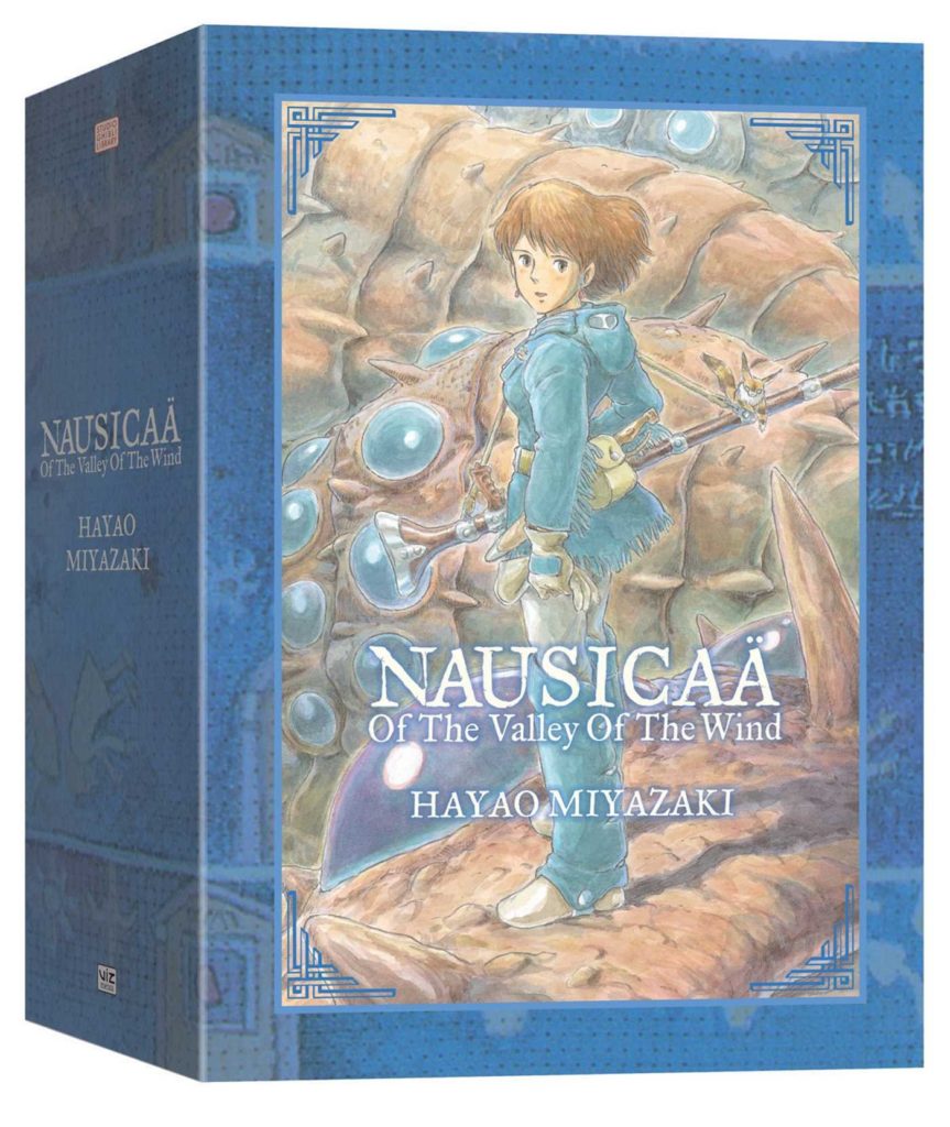
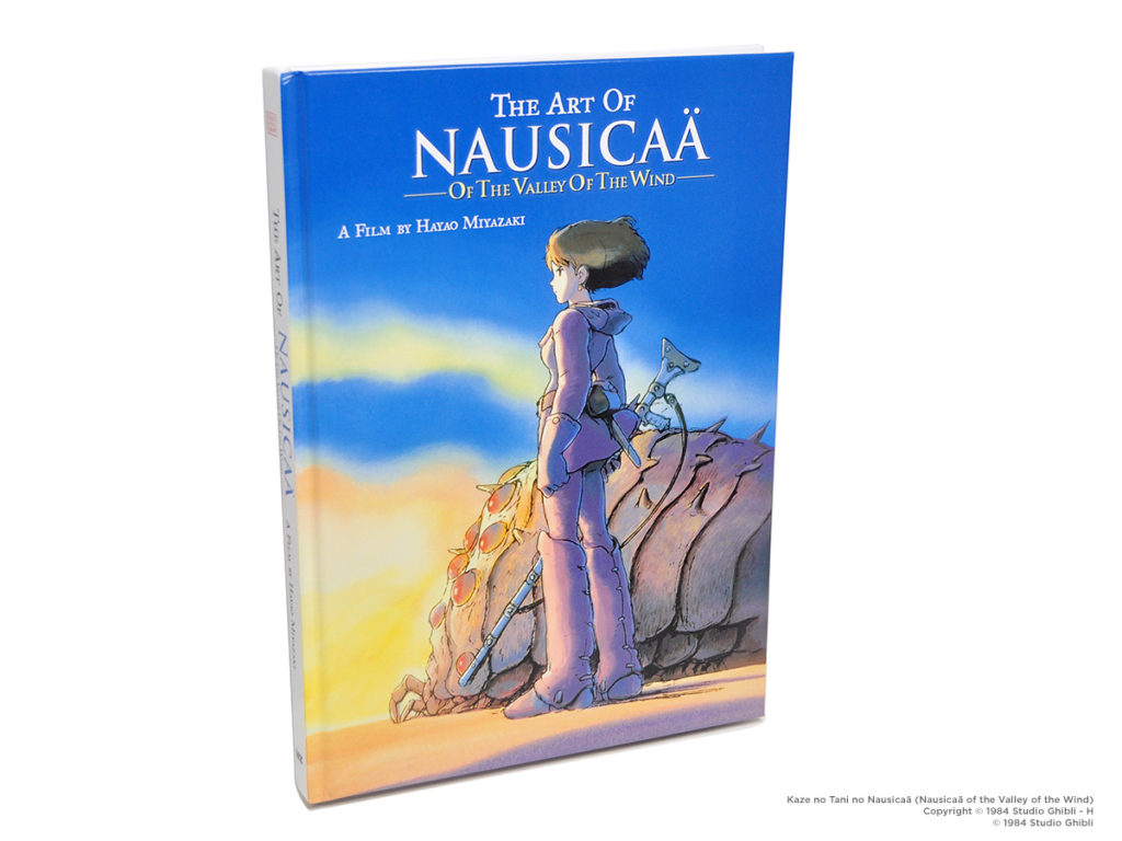
Nausicaä of the Valley of the Wind, Volume 1 (Editor’s Choice Softcover Edition)
By Hayao Miyazaki
Volumes 1-4: Translated by David Lewis and Toren Smith (Studio Proteus)
Volumes 5-7: Translated by Rachel Thorn
Translation Assistance by Kaori Inoue and Joe Yamazaki
Published by VIZ Media (Print Only)
Show notes by Christopher Butcher and Debora Aoki. Audio Editing by David Brothers.
Before we get started:
In the episode, we mention that this was translated by Rachel Thorn. That’s not technically correct, she translated volumes 5-7, and David Lewis and Toren Smith of Studio Proteus translated the first four volumes, including the one that we read this week. I’m very sorry for the error.
These notes wouldn’t be possible without the invaluable resource that is The Ghibli Wiki, aka Nausicaa.net. It was one of the very first websites I visited on the internet, a very, very long time ago.
In particular, I found this list of Nausicaä ‘s original serialization dates very helpful: http://www.nausicaa.net/miyazaki/manga/chapter_guide.html
And this list of the various published versions of Nausicaä was also very helpful:
http://www.nausicaa.net/wiki/Nausica%C3%A4_(Manga_Availability)
And we reference this interview between Miyazaki and Moebius:
http://www.nausicaa.net/miyazaki/interviews/miyazaki_moebious.html
There’s a ton of great content on that site. Thanks to everyone who’s ever contributed to an amazing free resource like this, I’m so glad that it still exists.
Also, I couldn’t figure out where to fit this, so, uh, there was a Nausicaä Kabuki that my friend Gary told me about…! I kinda wanna get this DVD (seriously, still making DVDs in 2021) next time I’m back in Japan.
00:00 Here’s VIZ’s description of Nausicaä of the Valley of the Wind:
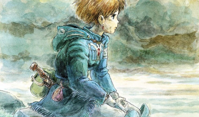
In a long-ago war, humankind set off a devastating ecological disaster. Thriving industrial societies disappeared. The earth is slowly submerging beneath the expanding Sea of Corruption, an enormous toxic forest that creates mutant insects and releases a miasma of poisonous spores into the air. At the periphery of the sea, tiny kingdoms are scattered on tiny parcels of land. Here lies the Valley of the Wind, a kingdom of barely 500 citizens; a nation given fragile protection from the sea’s poisons by ocean breezes, and home to Nausicaä. A young princess, Nausicaä has an empathic bond with the giant Ohmu insects and animals of every creed. She fights to create tolerance, understanding, and patience among empires that are fighting over the world’s remaining precious natural resources.
VIZ Media
As for the author himself?

Hayao Miyazaki is an acclaimed animator, director, writer, and manga artist, and was born in Tokyo in 1941. He is widely considered one of the best animators of all time. His long career started in 1963, when he joined Toei Animation as an ‘in-betweener’ animator, and it’s also where he met his collaborative partner Isao Takahata. His resume is frankly too long to list, go check the wiki for that.
While working full time in animation, Miyazaki started creating the Nausicaä of the Valley of the Wind manga in 1982, serializing it in the animation-related magazine Animage, rather than a traditional manga magazine. Working with his production team, his manga was turned into a film which he directed, and the success of the film enabled him to start his own animation studio, Studio Ghibli, in 1985. His animated film Princess Mononoke (1997) was the first animated film to win Japan’s Academy Award for Best Picture, and his 2001 film Spirited Away won the American Academy Award for Best Animated Feature.
00:42 We mention, in podcast, the very show notes you’re reading now! Meta!
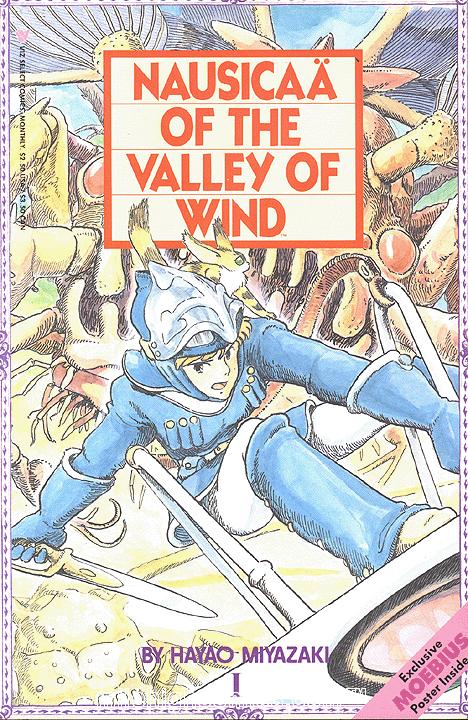
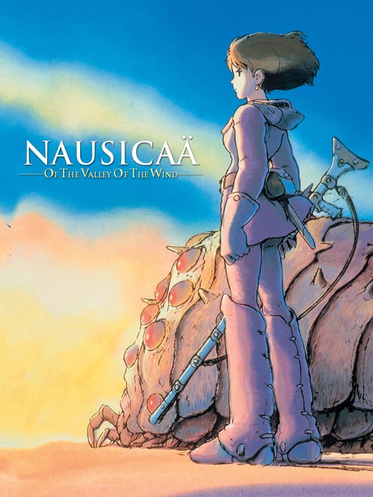
1:30 Speaking of Nausicaä having been consistently in print in English, give or take, since its initial graphic novel printing in 1990, that means that there are 4 English editions of Nausicaa from VIZ:
- The 1988 comic book series, which ran for 27 issues. American comic book size, and ‘flipped’ to read left to right.
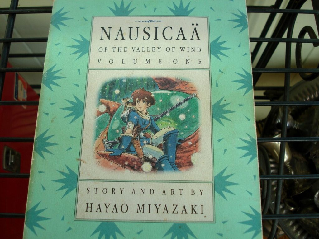
- The “Perfect Collection” 1990 tankobon-size collection of 4 trade paperbacks. Published with 2 different sets of covers, a design-oriented cover and an image-oriented cover (see below). This also released as a 4-volume boxed set. These books collect the left-to-right edition, and were printed at roughly the size of an 8.5” x 11” piece of paper, folded in half and turned on its side. Not big.
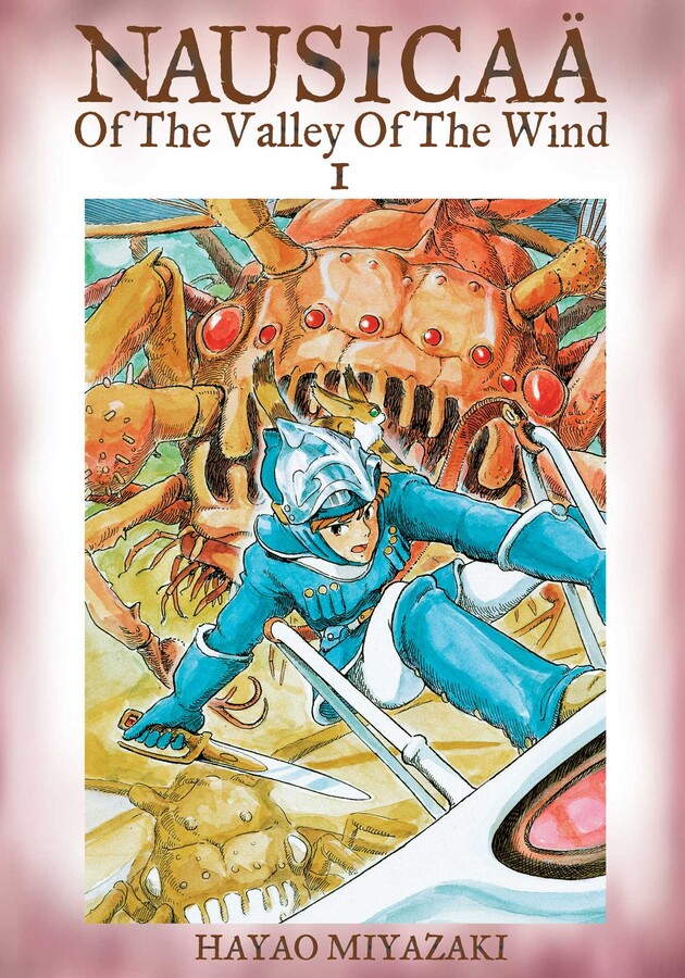
- The “Editor’s Choice” 2004 up-sized (B5, or roughly North American comic book size) 7-volume edition with brown ink and colour insert posters. This featured (hazy memory going back to 2004 here) new/better scans of the artwork as compared to the Perfect collection.
- And finally, the most recent edition from 2012, a slip-cased, oversized 2-volume hardcover collection.
So yeah, if you’ve been collecting comics and manga for a long time, you might have one of many different editions of this comic. If you’re reading along at home, we’re ‘officially’ reading the first 130 pages or so.
03:40 So I compare Nausicaä and AKIRA here… and I kind of never get back to it later in the episode like I say I will! We actually really don’t talk about the Nausicaä anime almost at all, and there’s so much to talk about, I mean we literally never mention Warriors of the Wind, and it would’ve even been germane to the discussion. But at the end of the day, this ain’t Animesplaining so we’ll let that go.
Just kidding!
As mentioned, Hayao Miazaki’s Nausicaä manga started publication in Animage magazine in 1982, at roughly the same time that Katsuhiro Otomo began to serialize AKIRA in Kodansha’s Young Magazine. According to this interview, Otomo actually went to New York in 1983(!) and met with Marvel Comics editor Archie Goodwin, and discussed them licensing it for print, and what it would take to make AKIRA a success in North America. They then spent 5 years figuring out how it would work, adjusting (redrawing!) the art, removing Japanese sound effects, and of course colouring the work with Steve Oliff, for it to debut in 1988 from Epic Comics, an imprint of Marvel. Despite a 5-year head-start, the series didn’t finish serializing from Epic until 1995, due to Otomo getting waylaid by the creation of the AKIRA movie, and then his follow-up film Steamboy.
Meanwhile, I couldn’t find much info about VIZ’s licensing and release plans for Nausicaä, but VIZ as a company didn’t incorporate until 1987. It’s interesting to me that the interview above mentions that VIZ put an offer in on AKIRA, when they didn’t start offering on manga (according to the Wiki) until like… 1986 at the earliest? Anyway, VIZ’s first manga was published in 1987 (Legend of Kamui (Kamui-Den), by the recently departed Shirato Shinpei), co-published/distributed by Eclipse Publishing(!). VIZ’s first issue of Nausicaä was published in 1988, same as Epic’s AKIRA. Coincidentally, VIZ’s last issue of Nausicaä was also published in 1996… just like Epic’s AKIRA! Not too shabby either, considering that the Nausicaä manga ended up running until 1994 in Japan, four years later (give or take) than AKIRA’s Japanese serialization.
But the films, we need to talk about the films.
With the Nausicaä manga serializing beginning in 1982, and the film releasing in 1984 in Japan, it would seem at first glance to be somewhat surprising that the manga didn’t make its way to North America until 1988. But, and I can’t stress this enough, there wasn’t a North American manga industry in 1982. I mean, random projects here or there, but there just wasn’t regular manga publishing at that point. It wasn’t until VIZ partnering with small publisher Eclipse in 1987 to release Legend of Kamui, and First Comics’ publication of Lone Wolf and Cub (complete with covers by North American comics stars like Frank Miller, Matt Wagner, and Bill Sienkiewicz) that same year, that ‘regular’ manga publishing started at all. That Nausicaä was published in 1988 when it wasn’t overly violent, ‘mature’, or even terribly infused with the Japonisme of the late 1980s at all, is kind of remarkable.
But it might’ve happened because of the film adaptation… but not in the way that you think. You see, Nausicaä of the Valley of the Wind, the 117-minute theatrical anime directed by Hayao Miyazaki from 1984, got an English-dubbed theatrical and home-video release in 1985. If you’ve just started your first company and there’s a manga with a ton of buzz and the anime adaptation is getting a theatrical/home video release, why WOULDN’T you try to license that manga?
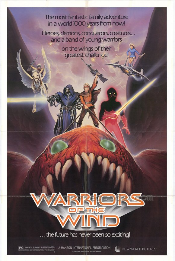
Well, sort of. You see, it was actually a VERY BAD English dub and theatrical/home-video release of Nausicaä, and it was called Warriors of the Wind. If you don’t click through to the wiki there, Warriors of the Wind was only 95 minutes long, cutting about 23 minutes out of the original (ironically, mostly scenes of Nausicaä herself, anything considered ‘slow’). The result was a bit of a garbled mess that I actually saw on home video, just a year before my pals who did fansub tape-trading showed me the real one, direct from Japan. It’s a badly edited film, and you can read all about the cuts (and Miyazaki’s reaction) at this blog post. Let’s just say, they tried to make it much more of a boys’ action story (and you can see that shift of emphasis reflected in the movie poster for Warriors of the Wind), and that doomed it from the start.
Miyazaki being horrified with the Warriors of the Wind-ification of his Nausicaä film reportedly gave translator and manga industry legend Toren Smith (R.I.P.) the ammunition that he and VIZ needed to approach Miyazaki, and offer to do an authentic translation of the story via the manga, and that’s exactly what we got! (Worth noting that all of this is mentioned in the Wiki, and I’d heard it for years in fan circles, but the cited articles in the wiki are no longer visible, sadly, I’d love to keep digging). So yeah, Nausicaaä‘s film release is the reason we were able to get the Nausicaä manga… in a roundabout way.
I think to this day that it’s shocking that AKIRA got an uncensored, unedited, unfucked-with release in North America in 1988. Maybe it had Miyazaki’s reaction to Warriors of the Wind to thank for that.
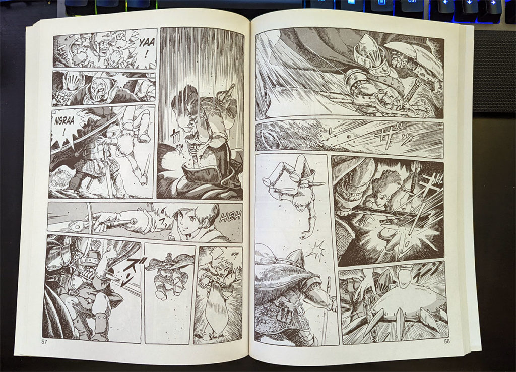
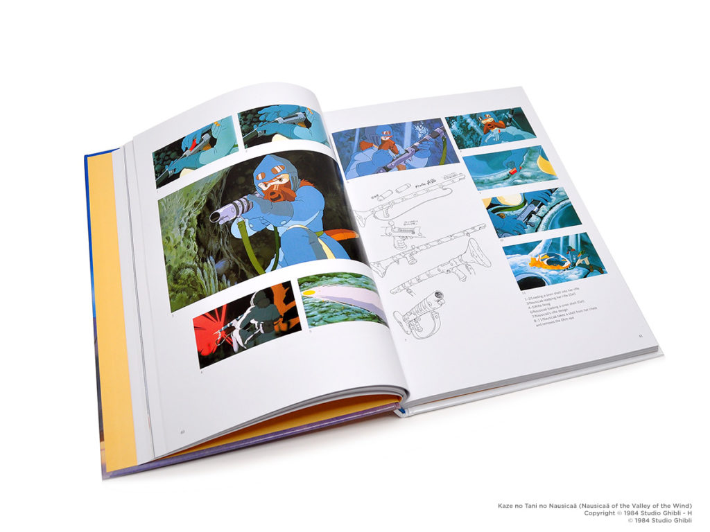
06:00 “Weird panel decisions.” This manga does not breathe, exactly. Even in the big, beautiful, set-piece reveal images, they’re rarely granted more than a third of a page in size. Here’s a few examples.
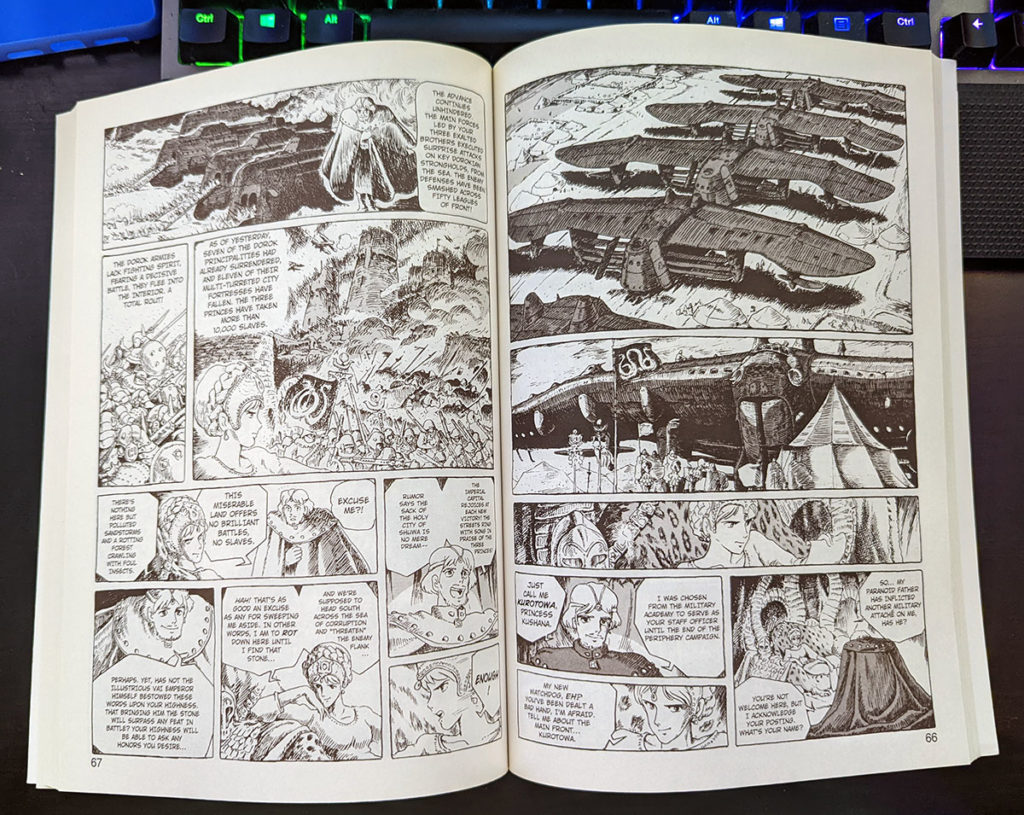
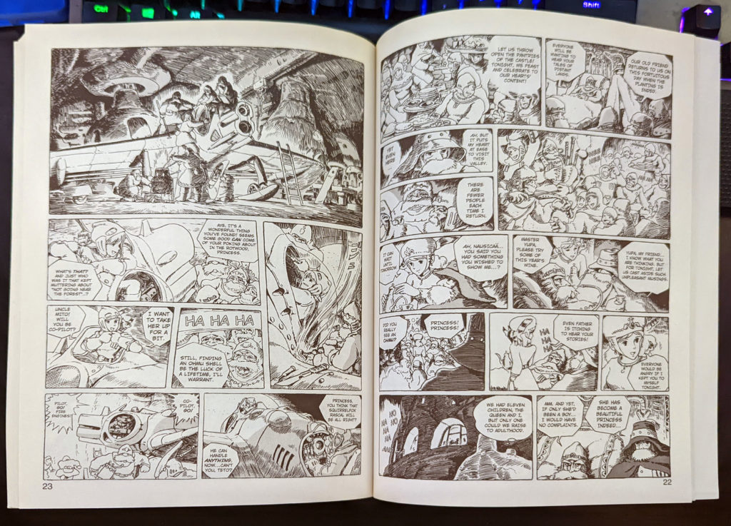
Like I said, even the best illustrations are rarely given more than 1/3 of a page to build, and never more than one of those in a spread. Also, so much text! As Deb mentions later, this does change a little bit as the series goes on, dropping from 12 panels a page 22 above, to 6-8 panel pages more often. This first volume though? It’s dense.
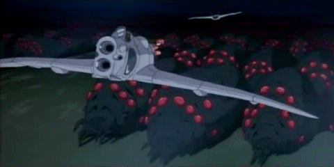
06:30 OHMU VS OHMU! CHOOSE YOUR FIGHTER
VERSUS
07:42 So here’s the text again, from the introduction written by Miyazaki for the first volume of Nausicaä of the Valley of the Wind.
The people at Animage [a premiere Japanese animation magazine] encouraged me to do comics, so I went ahead and set down my own concept of Nausicaä. Now I am “doomed” and have to learn the hard way again why, a long time ago, I concluded that I had no talent for comics and gave them up [Miyazaki is being overly modest here]. Now I just want this girl to attain freedom and happiness.
Hayao Miyazaki, from the introduction to Nausicaä vol. 1
I think he’s a brilliant artist, but comics storytelling is a different, related skill, to drawing!
9:24 David shouts out David Bednar, aka ykarps on Twitter, so why not go check him out?
11:00 I think it’s fair to say that Hayao Miyzaki is first and foremost a filmmaker, and an animated filmmaker at that. It makes it interesting to me to be talking about his manga here, but a theme we’ve explored a lot on the podcast (as I mention here) is that storytellers in manga and anime do get do-overs, and that’s been a theme of the last few episodes. From the Wotakoi anime reimagining and reordering the entirety of the Wotakoi webcomics into a cohesive narrative, to Gundam: The Origin retelling the kids’, toy-driven sci-fi TV anime from the late 70s into a mature action/military manga, sometimes, creators get do-overs to refine their work. I think this is my thesis on Miyazaki’s Nausicaä (1984) versus his Princess Mononoke (1997). Not just themes, but characters and character archetypes and major plot points are repeated between the two stories, characters pushed and refined, relationships made both more subtle and much more intense, and the themes of what mankind is doing to the environment laid much more bare. It definitely feels, to me, like Miyazaki as a much more mature creator wanting to take another stab at the same story. A quick Google search reveals that I’m not alone in this thought, lol.
It’s particularly complicated, because the Nausicaä anime is only part of the story, a simultaneously condensed and expanded (refined) version of the first few volumes, but the manga also tells a more complete story, builds on some of the ideas of the movie, shows different events in a different order. They play off of each other in a way I don’t feel like AKIRA does.
Of course, not every do-over is welcome, and should be done with the creator’s involvement (or at least approval) and this is where I was going to talk about Warriors of the Wind, and opted not to, because we quickly went on a tangent to another idea.
Also, David is right, this is awesome:
12:20 Hayao Miyazaki’s film Spirited Away was released in Japan in 2001, and North America in 2002. It won the 75th Academy Award for Best Animated Feature in 2003.
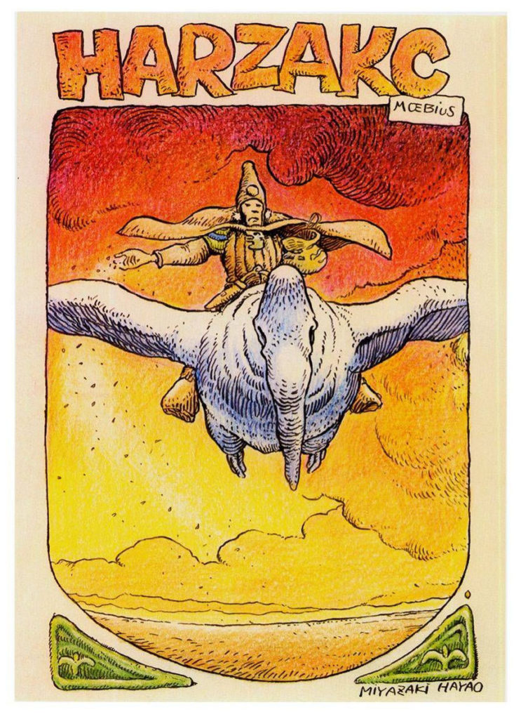
16:50 Ack! I can’t find the image of the the birds from Moebius’ Arzach that Deb mentions in my books. But when I went looking for it in my books and online, I actually saw this fan-art that Miyazaki drew of Arzach, which is very cool!
Don’t worry, we get into more Moebius in a few minutes.
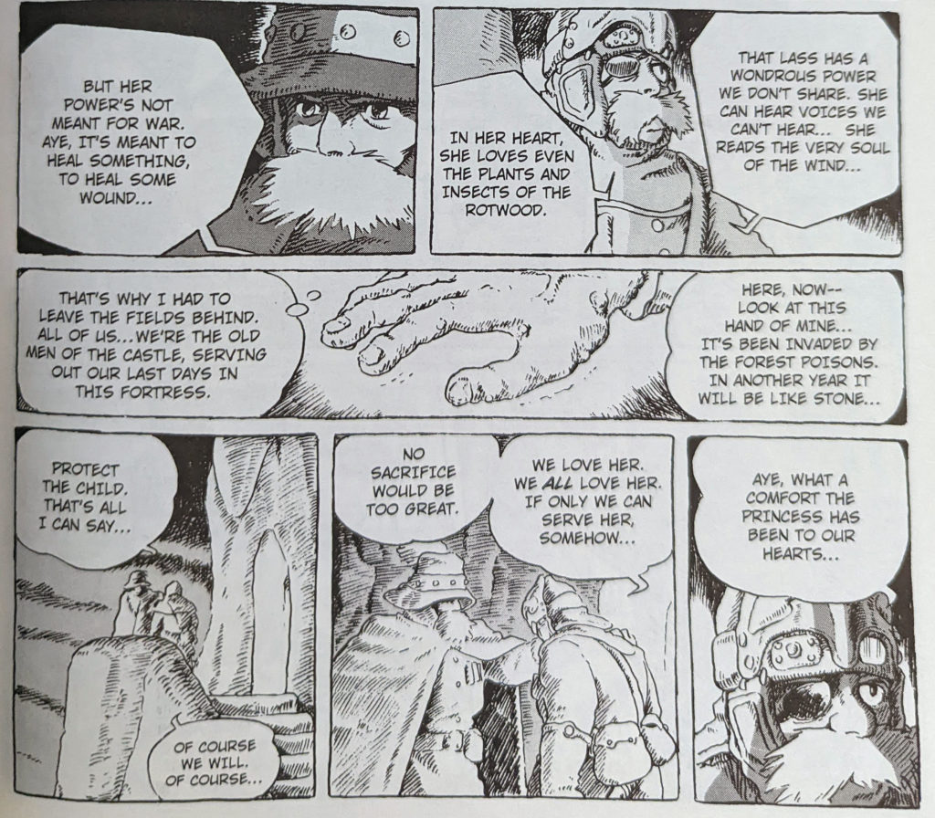
18:00 Nausicaä fights a big dude! This is an awesome sequence! Still lots of panels!
Also: Didn’t catch that David called him Steve Buscemi under his breath here, misheard him. So glad he repeated this joke later, it’s gold.
19:00 I really think that Nausicaä is a book to luxuriate in, and not try to read on a deadline. Honestly, it might just not be where anyone’s head is at these days, I can’t say for sure. But re-reading it was a warm, familiar feeling for me, even when it dragged a bit. 🙂
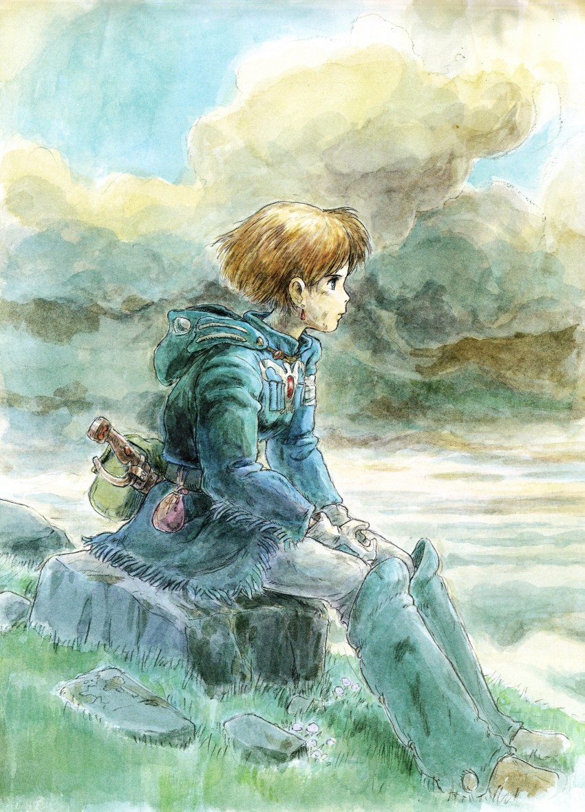
20:00 The watercolour paintings Miyazaki did for this series are actually very pretty, Deb is probably right, colour might help a lot.
20:30 I inserted this description up top! Sorry!
21:00 As mentioned earlier, Nausicaä volumes 1-4 were actually translated by David Lewis and Toren Smith (Studio Proteus), and volumes 5-7 were translated by Rachel Thorn. Sorry again for the error.
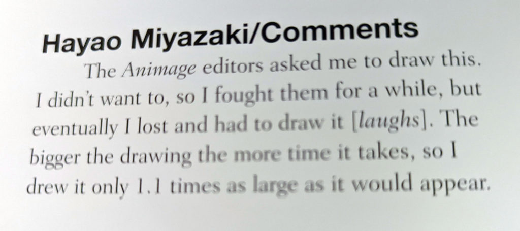
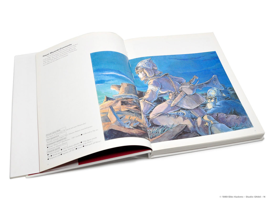
21:30 Miyazaki’s self-critical commentary from the art book Nausicaä Watercolor impressions is kind of brutal.
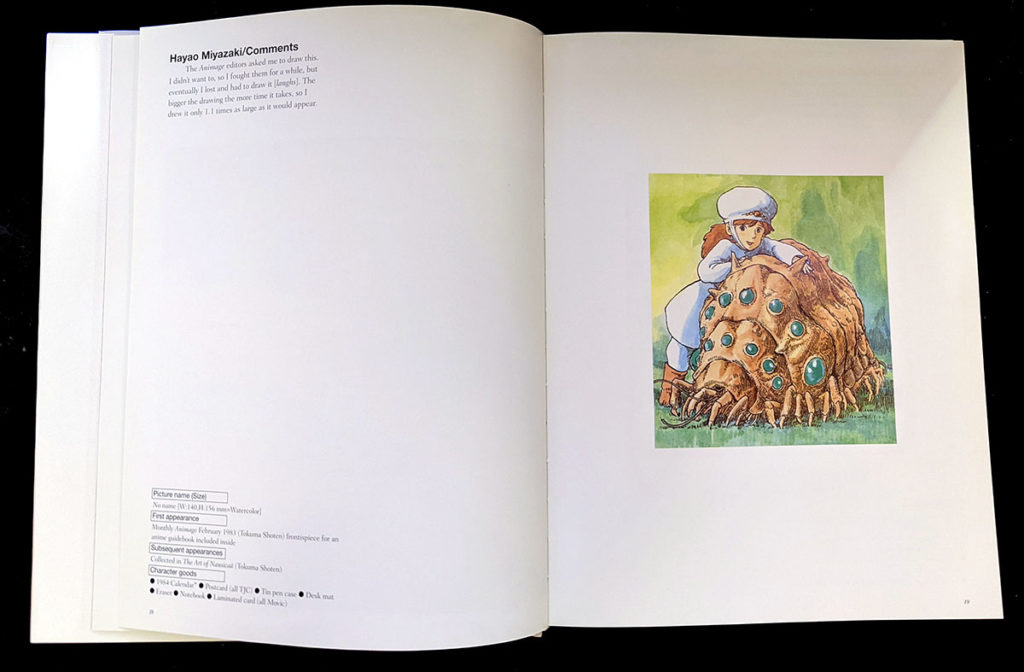
Here’s his comment from that page: “The Animage editors asked me to draw this. I didn’t want to, so I fought them for a while, but eventually I lost and had to draw it [laughs]. The bigger the drawing the more time it takes, so I drew it only 1.1 times as large as it would appear.”
As a fan, nothing changed my opinions of Miyazaki’s work more than reading Miyazaki talking about his work.
Anyway, if you want a copy of Nausicaä of the Valley of the Wind: Watercolor Impressions for yourself, it’s available from VIZ:
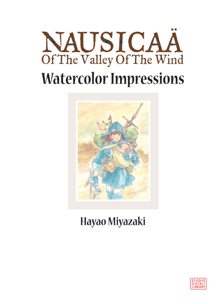
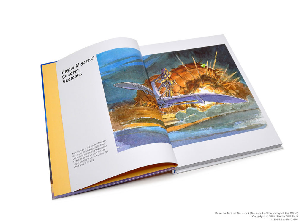
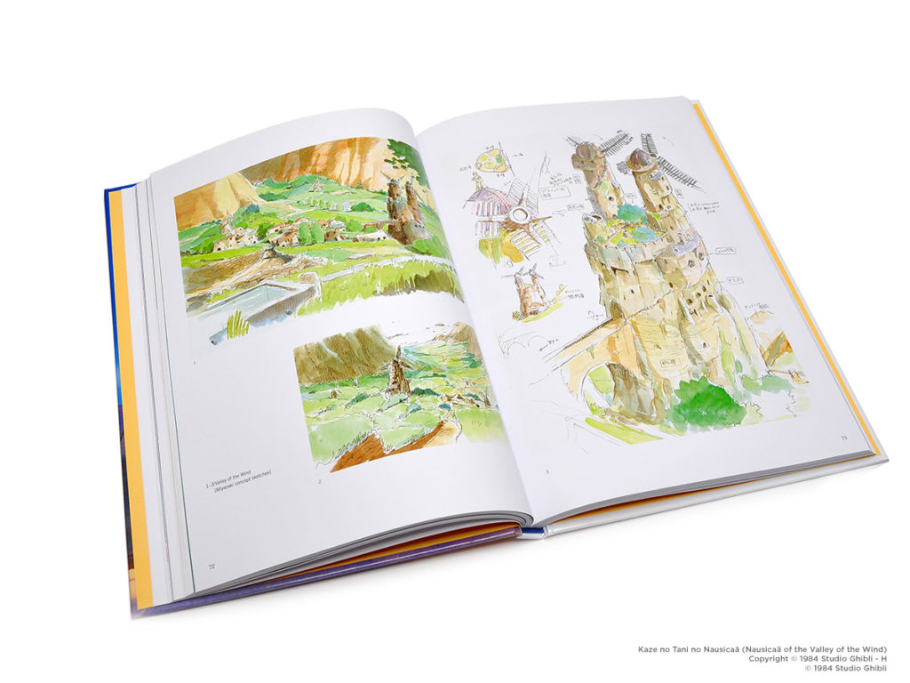
It’s a different book from The Art of Nausicaä, which is packed with development art for the movie. Still lots of Watercolors though. This really was a massive, massive work in Japan, with so much material produced. Also from VIZ.
23:00 So, let’s talk about Moebius.
First up, since David mentions it first, The Incal, is a sprawling sci-fi adventure comic illustrated by Moebius and written by filmmaker/writer Alejandro Jodorowski. I… am not going to get into Jodorowski or his oeuvre, other than to agree with David and say he works with fantastic illustrators like Juan Giménez, Travis Charest, Das Pastoras, and of course, Moebius.
Jean ‘Moebius’ Giraud (1938-2012) is a French artist and cartoonist who is one of the most acclaimed French comic authors of all time. His most famous works, including The Incal, Blueberry, and Arzach, are beloved to this day. Most North American comic fans are familiar with Moebius because he did a Silver Surfer graphic novel, Silver Surfer: Parable, with Stan Lee in 1988 that was published by Epic/Marvel, and has been reprinted many, many times in many different formats over the years. It kind of has its own mythology, at this point.
[Deb:] If you want to get into Moebius, Dark Horse is publishing some of his graphic novels as the Moebius Library series, and Humanoids has a timeline of his career, plus a few of his works in English too.
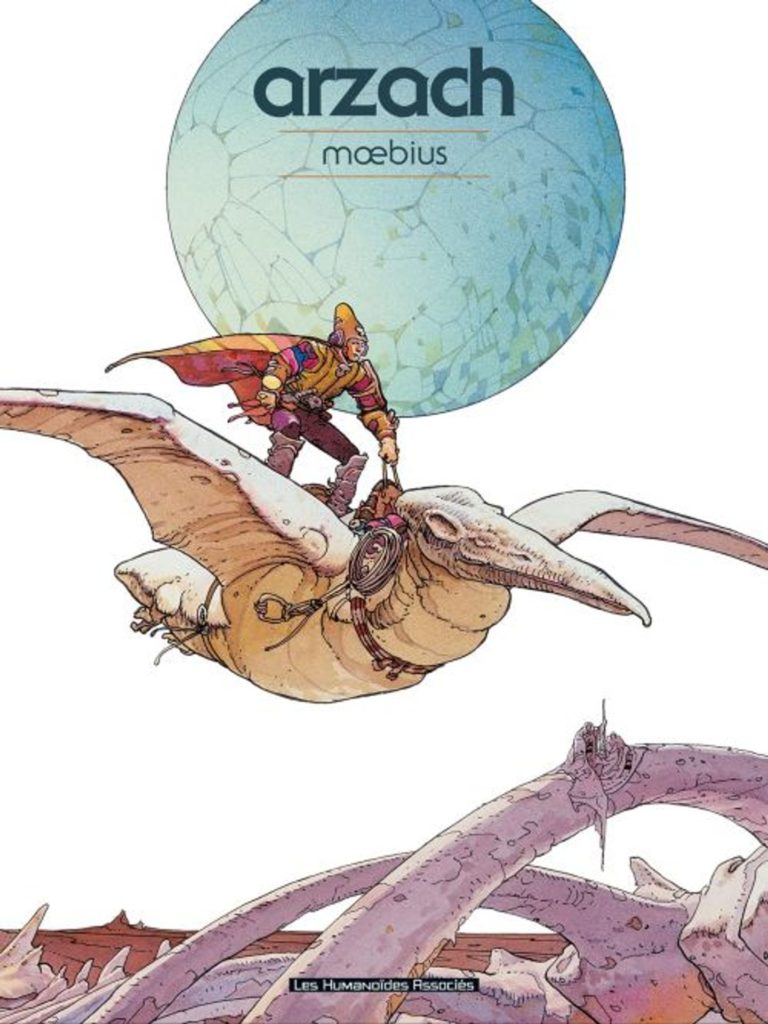
Moebius and Miyazaki were good friends actually, and Moebius’ Arzach was a direct influence on Nausicaa. Miyazaki even throws in a nice nod to the series, with the flying pterodactyl that Deb mentions in volume 3. (That I hope we can find the image of!).
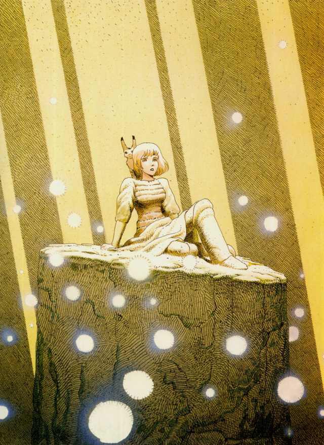
Interestingly, Moebius was quite a fan of Nausicaä as well, and produced this fanart of the character(!) that ran as a pull-out poster insert in the very first issue of the VIZ comic books.
Moebius also named his youngest daughter Nausicaä…! The folks over at the Ghibliwiki/Nausicaa.net have fan-translated this lovely interview between Miyazaki and Moebius, and it’s pretty awesome and shows their camaraderie:
http://www.nausicaa.net/miyazaki/interviews/miyazaki_moebious.html
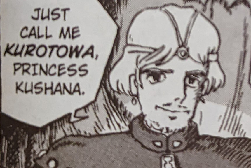
30:00 Kurotawa and Steve Buscemi: Separated at Birth?

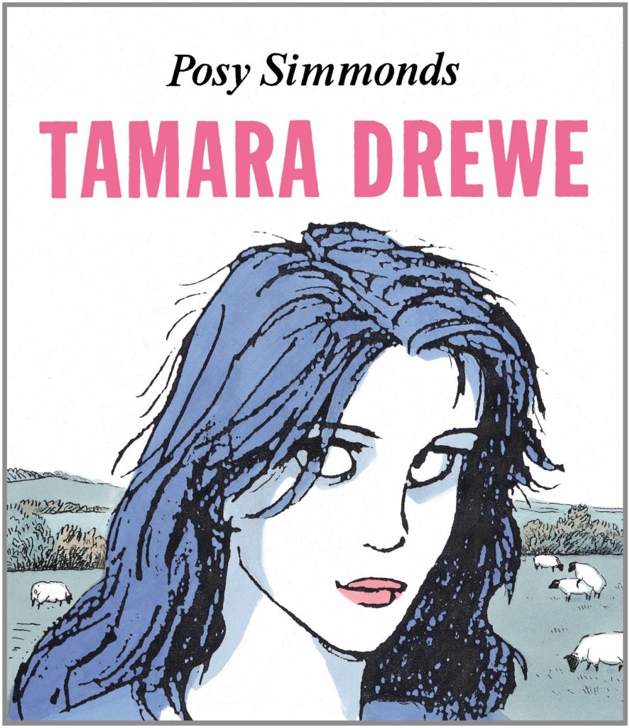
32:00 Deb mentions Tamara Drewe, a British mystery graphic novel by Posy Simmons, a sort of weekend-getaway-mystery-slice-of-life graphic novel, based on the book Far From the Madding Crowd. It’s not as well known in North America, but HUGE in the U.K.
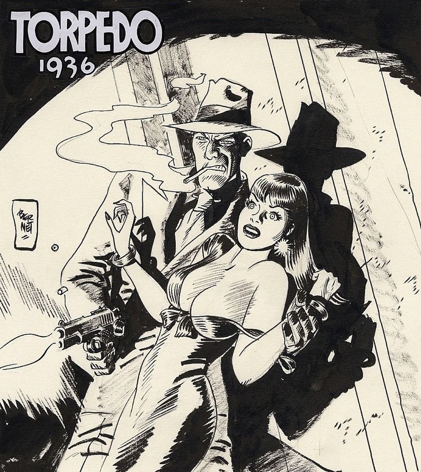
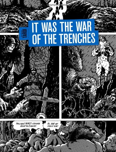
32:30 YIKES. We confuse BD illustrators Jordi Bernet and Jacques Tardi here, our sincere apologies. Jordi Bernet had a clean simplified style and great use of shadow. He illustrated the series Torpedo with writer Enrique Sánchez Abulí (picking up after Alex Toth left the strip). Meanwhile, Jacques Tardi created over 30 volumes of BD, including his masterpiece from 1993, It Was The War of the Trenches, currently published in English by Fantagraphics. There’s a reason that this isn’t BDsplaining.
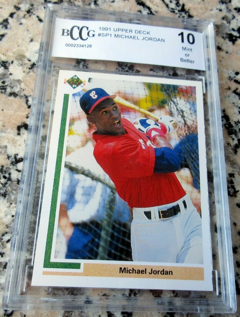
34:30 I think my mom has this baseball card?
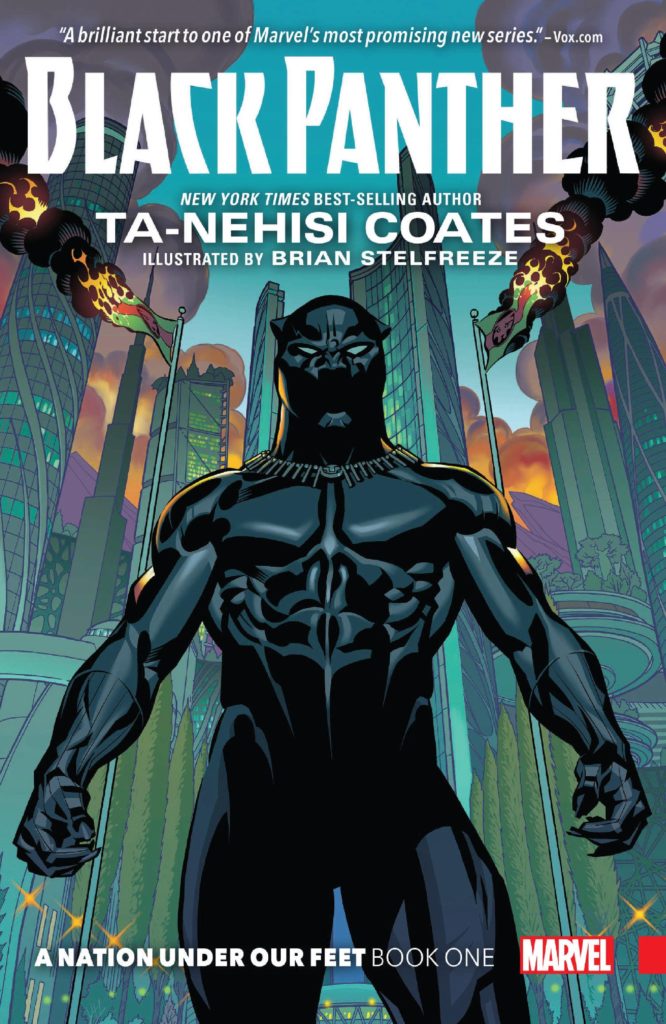
35:00 David and Chip talk about author Ta-Nehisi Coates, and his run on the Marvel Comics series Black Panther. Ta-Nehisi Coates, in addition to his comics work, is a literal genius, having been awarded the 2015 MacArthur “Genius Grant,” and the winner of the 2015 National Book Award for his non-fiction book Between the World and Me. He’s also written on a variety of subjects including social and political issues, including race and white supremacy, for numerous outlets including The Atlantic, The Village Voice, and TIME, among many other publications. It’s a bit weird and a bit great to see him doing superhero comics, and his run on Black Panther, various spin-off series’, and ultimately Captain America, is generally very well regarded. Coates worked with a number of artists on his work, but David specifically mentions the (amazing) Brian Stelfreeze, the artist of Coates’ first volume.
37:00 Nausicaä didn’t run monthly from 1982 to 1994, there were many year-long, or many-year-long breaks in between chapters.
You can read a little bit about the original serialization here: http://www.nausicaa.net/wiki/Nausica%C3%A4_of_the_Valley_of_the_Wind_(Animage_Magazine)#Serialization
And you can see the month-by-month breakdown of the Nausicaa serialization as it originally appeared in Animage here: http://www.nausicaa.net/miyazaki/manga/chapter_guide.html
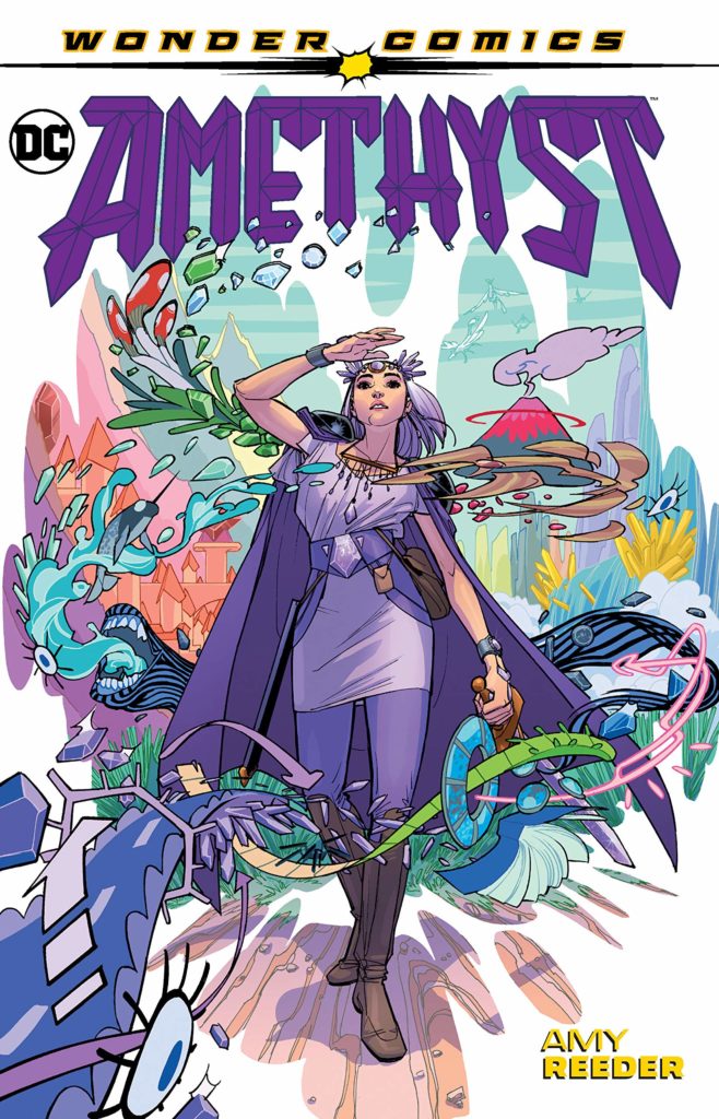
41:00 David mentions writer/artist Amy Reeder’s Amethyst DC Comics superhero graphic novel, featuring the character Amethyst of Gemworld. Gotta agree with that, I always thought Reeder’s work had Miyazaki vibes. 🙂
47:30 I’m really sorry, I couldn’t find the page where Kushana throws her ponytail on the battlefield, that David mentions…! If I find it later I’ll insert it here. She throws her ponytail on the battlefield.
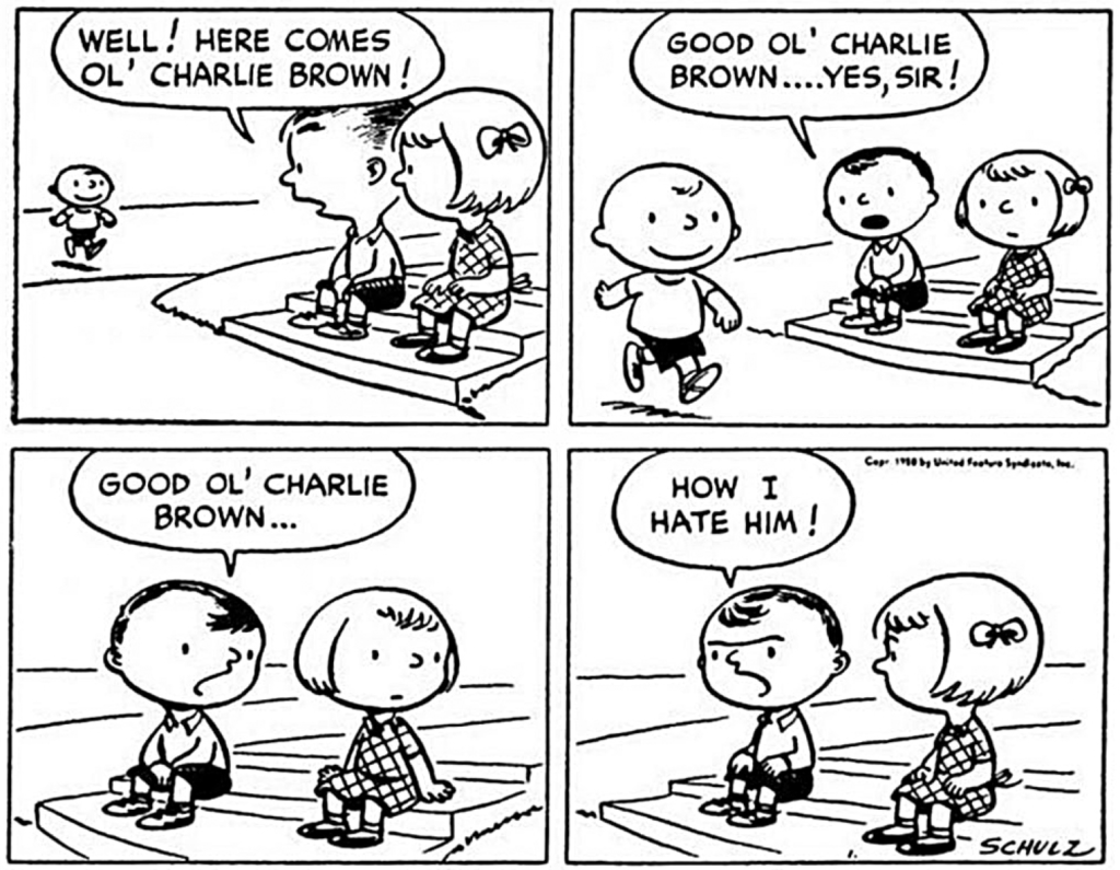
49:00 The first Peanuts comic strip by Charles Schultz is great.
[Deb:] Fantagraphics has excellent collections of Peanuts comics, including these early years strips.
50:55 Meant to say “There weren’t unsexualized young female protagonists in comics” here, just FTR.
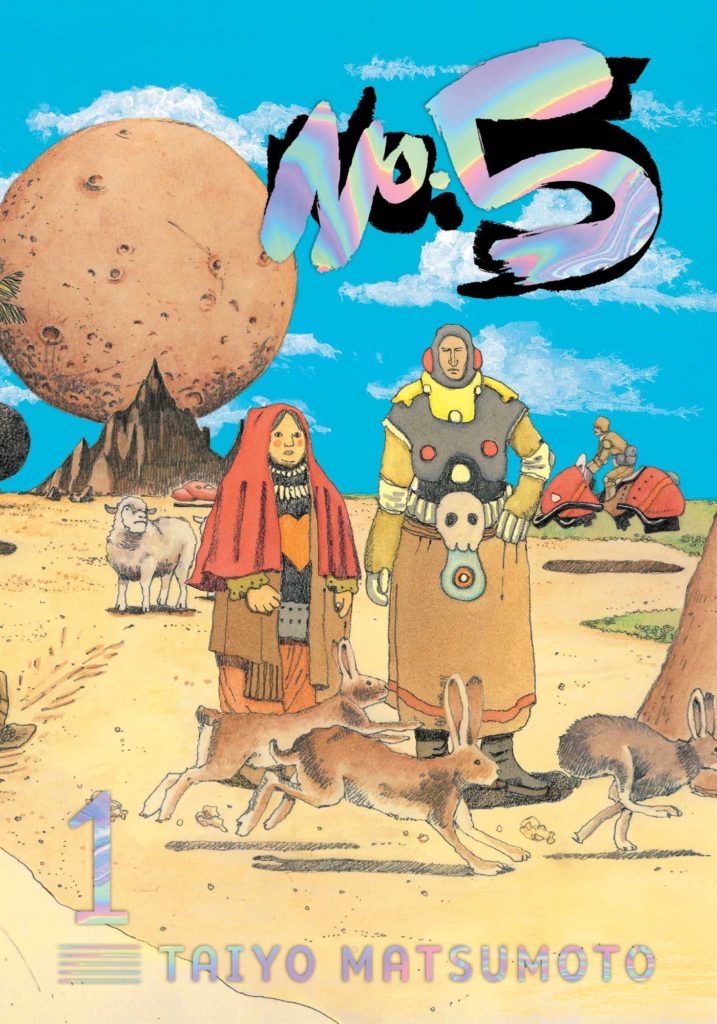
51:20 No. 5 by Taiyo Matsumoto is Matsumoto’s most experimental manga, published in Japan a little bigger than North American comic size, and features some pretty obvious international influences. It’s about fame being used and abused, and about heroes, and about superheroes, both the Japanese kind and North American kind and much more. I think Chip would hate it, but I think it’s a pretty special piece of comics. First 3 volumes (of 4) out now from VIZ.
52:00 David asked me to find a reference to the quote “Old men want to die in Nausicaa’s arms,” to see if it was true… and I couldn’t! I feel like it’s in The Art of Nausicaa, published by VIZ, which is a different book than Nausicaa: Watercolor Impressions, which I mentioned earlier. If I can get access to a copy of that book (or if I just buy it), I’ll post it here, someday.
52:16 Deb actually did get into the chosen one stuff, roundabout, with her stated reasons for not really digging the book all the way back at the beginning of the podcast. I think we close out this portion of the episode sort of doing the below, but in a lightly satirical way.
52:30 THE BREAK- After this point, all time stamps are guesstimates!
53:00 This week’s Reader Q&A question:
“Have you considered doing a special episode where the theme is “Northamericancomicsplaining?” As a lifelong manga reader, I always want to get more into NA comics, but like the common complaint don’t always know where to start (too many issue 1s). It doesn’t have to be a Superhero series, just thought it would be interesting for Chip to flip the format, and pick something he thinks the three other hosts would enjoy.”
Anders, via email
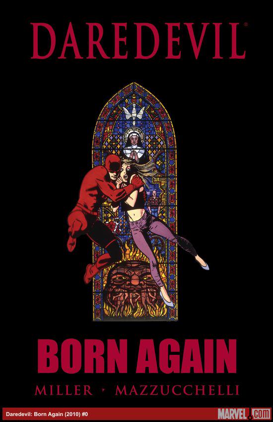
Right away, Chip mentions a comic he loves, Daredevil Born Again, by Frank Miller and David Mazuchelli, published by Marvel Comics. It’s a great comic, my friend Jason got me to (finally) read it a decade ago, and it’s very good. I was being a bit cheeky when I asked Chip if the colour holds up, because he’s very critical of colour in manga, and I was pleased to see he said no.
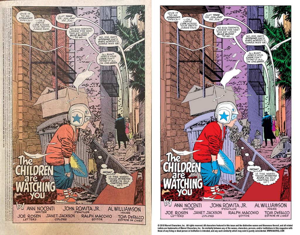
Chip then goes on (with some prodding) to talk about his favourite Daredevil run, by writer Ann Nocenti and artist John Romita Jr., and the problem of modern colouring: Over-saturated colors because of a change from newsprint (especially yellowing old newsprint) to glossy paper, or worse still, digitally projected colours. Chip provided an example image from the Nocenti/Romita Jr. run, original printing on the left, digital edition on the right.
Chip sez:
What I’m talking about more is what changes when you go from old newsprint process and modern printing. Like, they wouldn’t have coloured these books like this if they knew they would end up printed like that! They knew the paper was going to change the colours and they coloured accordingly. Maybe I’m just too nostalgic!! Fuck! I’m old!!!!
The ever-quoteable Chip Zdarsky
So, yeah, that might’ve been coloured with 100% Magenta and Yellow on the kid’s shoes and jacket in the original, but because they knew how it would print on newsprint, they knew how it would appear faded/less saturated. Even the ‘same’ colours on new paper look… Well.. Like the above.
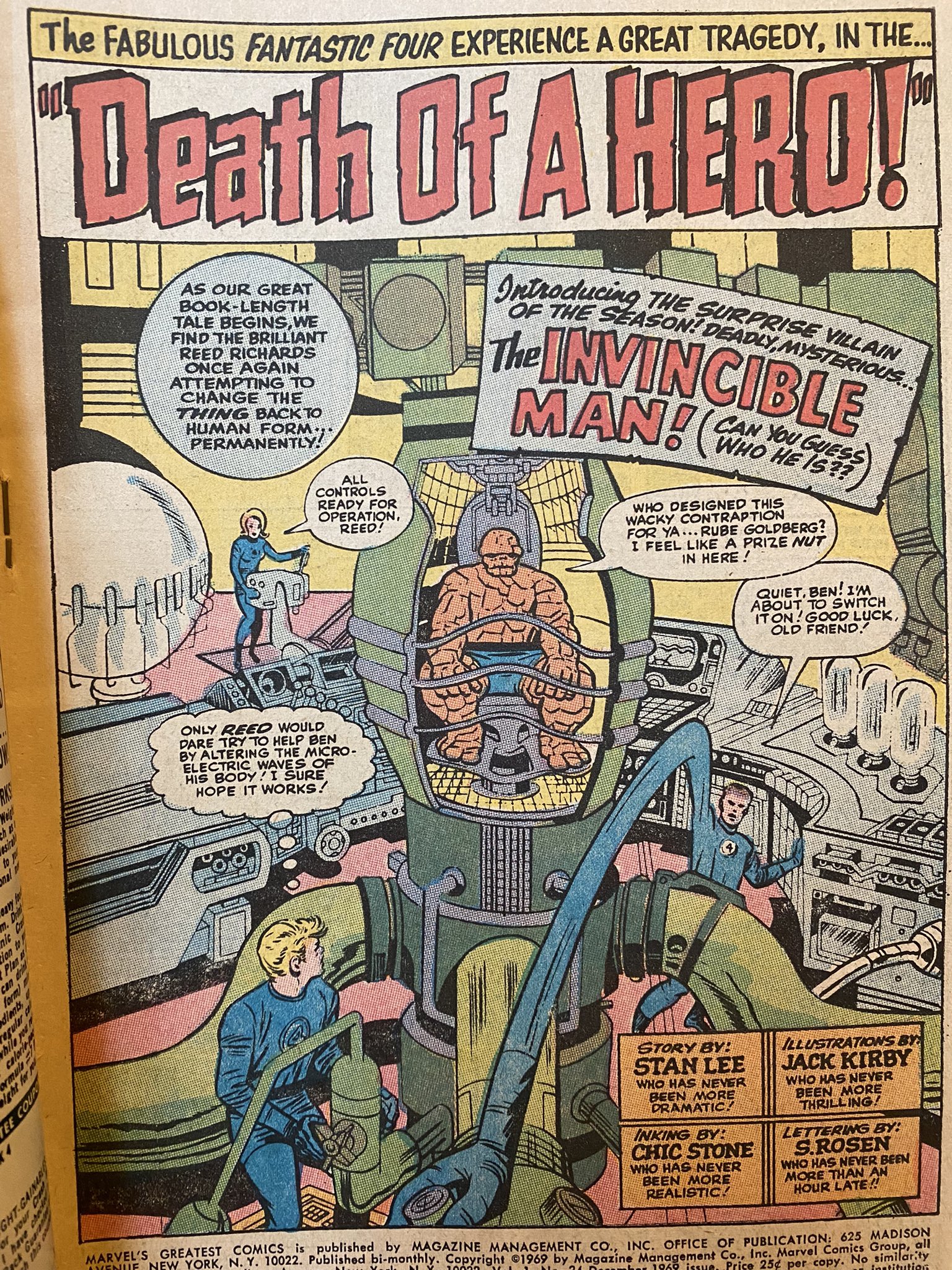
David actually brought up something interesting, from this recent tweet by comic creator Chris Burnham, which talks about levels of recolouring, and losing the integrity of the original colours. So this is three different versions of page #1, from Fantastic Four #32.
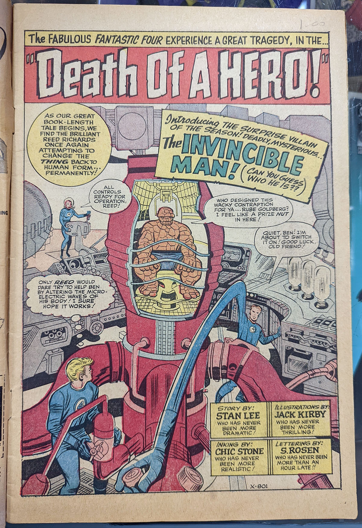
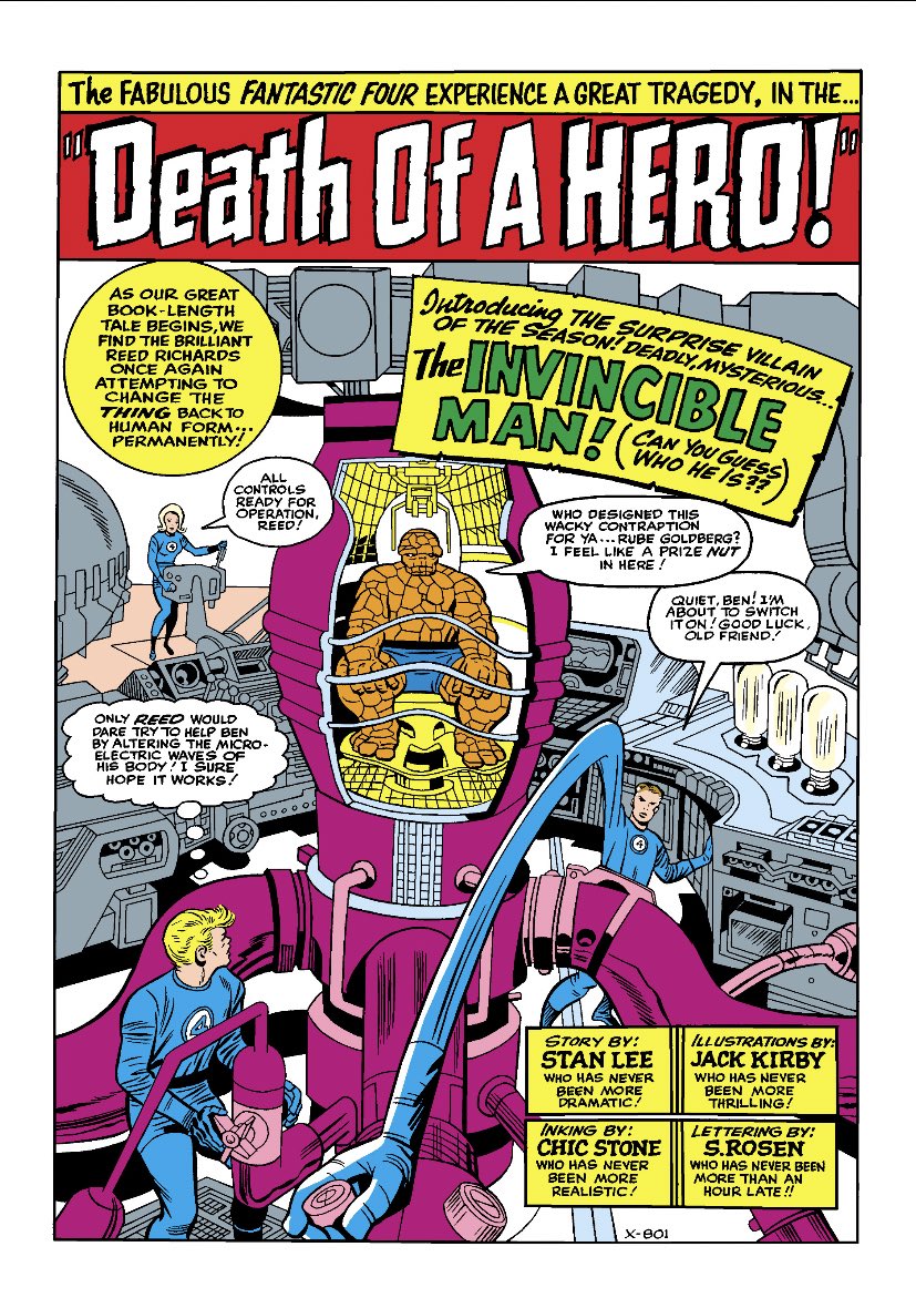
On the left, it’s an actual photo of page 1 of Fantastic Four #32, by Lee, Kirby, and Stone, from 1964. Thank you to The Beguiling for providing this! These are the original colours, printed on newsprint, and there’s something of a chance that Kirby would’ve actually seen them or been able to work with the folks doing the colouring at the time.
But the second one is REALLY INTERESTING! It’s actually a later reprint of FF #32, from Marvel’s Greatest Comics #24, from 1969. The original colours for FF#32 probably weren’t available any longer. Comics used to be coloured on acetate layers or with rubylith film (Letterer Todd Klein describes the process here). Things like colouring materials, acetates and rubylith pasteups and stuff were usually immediately thrown-out once the book was printed, so the 1969 it would’ve had to have been recoloured in house by someone who just, well, took another stab at it. They might not have even had a reference copy in colour of FF#32 to work from actually, so it was more-or-less up to the new colourist, which explains why it’s different. Still looks pretty good though!
But for the third image, that’s the current ‘digital’ edition of Fantastic Four #32, available on all of the, you know, services. What’s most interesting here is that the last image is technically a more ‘accurate’ recolouring of what the original colours are in the first printing of FF #32. It just looks kinda awful, and doesn’t take into account what newsprint printing looked like in the 1960s. Marvel thinks this is what accurate is, I’d say the second re-colouring is more ‘accurate’ because it’s in the spirit of the original.
My good friend, the artist and colourist Jose Villarubia has made dozens of posts on re-colouring old comics on his Facebook, about exactly this sort of stuff. I think his Facebook is friends-only, so instead, I’ll share this video where he talks about recolouring old comics. If this is interesting to you definitely check this out.
55:30 So David mentions that maybe we should all read Grant Morrison, Frank Quitely, and Jamie Grant’s 12-issue maxi-series All-Star Superman, published by DC Comics. David, in fact, DOES have all kinds of opinions about this series, as do Chip and I, and Deb seems up for it! I think that this would make for a hell of an episode… of another podcast, at some point. But yeah, good stuff…
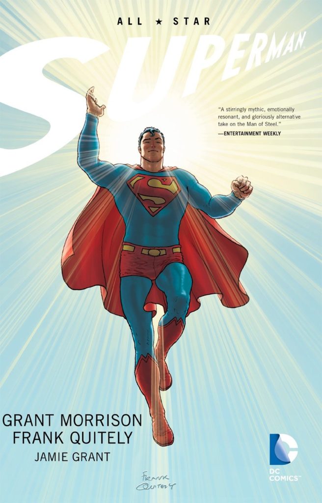
55:45 Speaking of hot takes though, David actually references this essay he wrote at his old website 4thletter, about his favourite issue of All-Star Superman. It’s a really good essay! I think he’s right, this is an incredibly strong issue of All-Star Superman, but it’s been a few years since I read it and I’d need to go back and see how I feel about it being ‘the best’, or whether or not the much-beloved issue #10 is the real deal.
[Deb:] Also, if you want to read more of David’s excellent essays about comics, he has I Used to Write About Comics, a collection of his greatest hits available to buy on his Gumroad site.
Also, look for us to cover the Deadpool manga in a few weeks. 🙂
59:00 TIME FOR SOME SHOUT-OUTS!
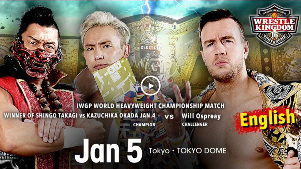
David shouts New Japan Pro-Wrestling’s massive WRESTLE KINGDOM series of bouts on https://www.njpw1972.com/.
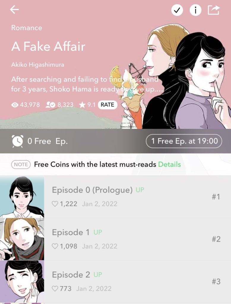
Deb shouts out the new manga webtoon by Akiko Higashimura, A Fake Affair, on Webtoon.
[Deb:] If you love Tokyo Tarareba Girls and enjoy Kdramas, A Fake Affair is the perfect lovechild of both genres, full of romance, humor (a cynical talking head bump!) and addictive plot twists that will get you spending way more money to read past the “wait until free” chapters. There’s also a live-action TV drama version of this story, but I don’t think it’s available as an English-subtitled series on any of the legal streaming sites yet? I think?
Here’s the plot description from Webtoon:
After searching and failing to find a husband for 3 years, Shoko Hama is ready to give up. Tired from work and marriage-less future prospects, she quits her job and travels on a solo trip to Korea. On the plane ride there, Shoko meets the young and attractive Jobanni Park, but accidentally tells him… she’s married? Now caught in her own web of lies, Shoko is about to have the wildest time of her life!
A Fake Affair description from Webtoon
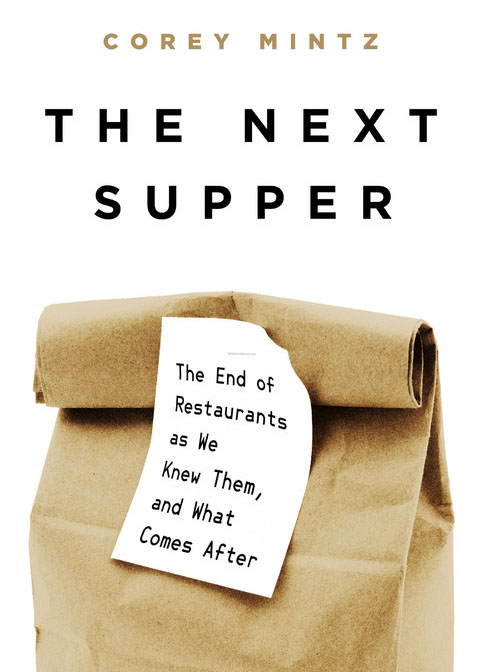
Chip shouts out Corey Mintz’s book about the ever-changing restaurant industry, The Next Supper.
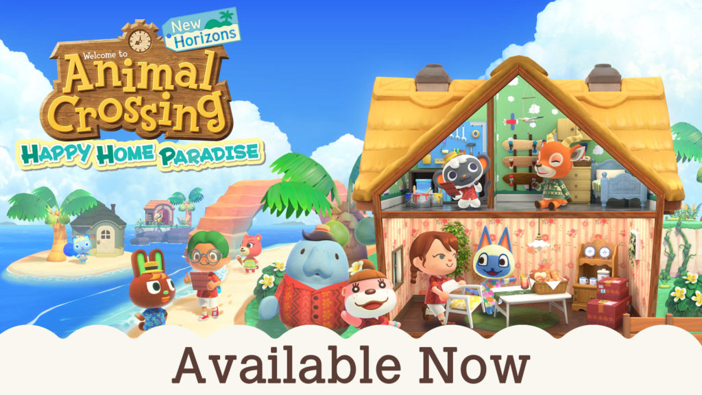
Christopher’s shout-out is the Animal Crossing: New Horizons DLC. Get it where you get your animal crossing!
And that’s the episode! Thanks so much for listening! Remember to check out your local comic and manga specialty shop for all the great books. Find one near you at comicshoplocator.com. You can also check out your local library for print and digital lending options on a wide variety of manga. And as always, thanks to D.A.D.S. for their musical accompaniment this week, and we’ll see you again next time! Take care!
I am so sad the gang did not like Nausicaa. I am still new to manga and use your recommendation as a guide for buying them. I only read six mangas so far(To your eternity, Frankenstein, A Bride’s story, Chainsaw man, Death note, and Nausicaa). I rank Nausicaa as number one among them. I agree the first volume is hard to get into because you drop in the middle of the story without knowing anything about this world. However, as you read more, it gets better, and you want more. In my opinion, Nausicaa is not only one of the best mangas, but it’s one of the best books I have ever read, and I LOVE it!
Also, I wish you recommend more mangas similar to this like other episodes.
Love the podcast and keep up the good work!
Thanks for the shout-out!
1.) I wonder how the hosts would have engaged with this manga if they made their way into the back half. Things like Lady Kushana becoming a deuteragonist to Nausicaa, the messier politics as nations go to war, the strange cult stuff and Nausicaa adopting a weapon of mass destruction as her baby… its… its a lot messier and weirder than the first half lets on! Like you said, Mononoke is absolutely a redo of Nausicaa, and a lot of that is pulling the messier things in— Lady Eboshi is far closer to Manga Kushana than Anime Kushana ever gets. Nausicaa honestly feels a little like a reverse Dune to me- in Dune, Paul starts as a human and transforms into an implacable and inhuman messiah; in Nausicaa, Nausicaa starts as a perfect messiah, but the business of saving humanity slowly messes her up, until she ends far more human than she began.
2.) Ahem, the uh, I’m not sure about arms, but I’m familiar with (I believe) comes from Starting Point, where, when asked why he made Nausicaa’s design a little buxom, explains “Thats not so she’ll be able to breast-feed her babies in the future or make love to a man who will steal her heart away. I think her bosom has to be large so she can embrace all those poor old men and women in the castle when they are dying.”
Its a… truly wild take??? Anyway, here’s an amazing comic somebody drew of it https://twitter.com/maggiekarp/status/1146159876592283653?s=21
I agree with Deb about the color.
Naussica has been on my almost buy list for a long time. Safe to say this episode has moved it from buy to library.
So I love the show, and have gotten a lot out of your recommendations and discussions, but my first comment is from a place of fully disagreeing with most of the hosts on a book and being annoyed by it. Sorry for that. Like Chris, I love Nausicaa, and I love it for a lot of the reasons everyone else bounced off it so hard. I love density in comics, the more panels on a page the happier I am, to the point where a comic has to work really hard to justify a full-page splash for me to enjoy it. Give me the Hernandez Bros. telling an entire scene in a panel for multiple pages, or P. Craig Russell breaking out a 13-panel sequence while adapting opera, or Archie Goodwin and Walt Simonson putting down an 11 panel ninja fight, or any random issue of 2000AD, please, so long as the artist aren’t murdered by the workload. So seeing Miyazaki jam as man panels into a page was never the barrier for me that it was with everyone else. I never felt the pages were cramped after the first party sequence in the castle.
I’d further argue, in an annoying internet comment thread way, that Nausicaa is great comics, though that requires a different view of what to expect from comics. As everyone said, Miyazaki isn’t drawing panels that flow from one to the next. If you think that panels need to do that, and are focused on how the overall page structure fits together, then yes, especially the early part of Nausicaa is going to look bad to you. But I think that misses how Miyazaki uses his layouts and gutters to guide the eye. Every page in Nausicaa is structured around full-page horizontal gutters, where everything between two gutters is read in sequence before moving down to the next tier. This allows Miyazaki to do whatever he wants in each panel without sacrificing the readability or the flow of the page.
Which brings me to why I think Nausicaa is great comics. Miyazaki’s work method on his films and on Nausicaa is to just start drawing. When he’s making a movie, he doesn’t write a script or an outline. He has a few ideas and themes he wants to work with, then he just sits down and starts drawing storyboards and figures out the film while he’s drawing it. He does the same thing with Nausicaa. When drawing Nausicaa, he would just start on the first panel and draw whatever he wanted and then move onto the next one, figuring out what the next panel was going to be based on where the story was and what he felt like drawing that day. He’s able to get away with that lack of planning because of how he uses the gutters to guide the reading order, which means to read a page of Nausicaa is to watch Miyazaki improvise his way through a sequence. This makes Nausicaa essentially a work journal of where Miyazaki was on each day he was drawing, which is unique in comics. It’s very different from the Amount of Space=Story Importance philosophy of contemporary Western comics, and no one else can really work that way, but I’m glad this exists in the form it does, because it is so different.
Final point, because I don’t want to turn into the angry internet guy nitpicking people’s taste, but on the point of Nausicaa being perfect, yes, she is. However, I don’t think that’s a problem for the Nausicaa manga, because Miyazaki is interested in other things. Nausicaa is his idea of what a good person should be, and the entire series is about testing whether someone can be involved in the world and stay true to their ideals. So Nausicaa believes all life, human, animal, and plant, is sacred. Great, how does she put that into action? How does she live that idea while in the middle of a war? How does she balance the needs of humans with the needs of nature? Which compromises will she accept, and which ones will she not? It’s not a story where Nausicaa overcomes some character flaw, it’s a story about how the world will change her. Which, if you are annoyed by how perfect she is, is not going to work for you.
TLDR: I have different tastes on this than most of the crew, and I think Nausicaa is great. Thank you for listening.
I quite enjoyed Nausicaa, and I’m a little surprised that it didn’t land for most of the Mangasplainers.
I usually avoid overly dense world building-heavy fantasy & SF (I’m looking at you, Dune.) but in this case I was fine with the way the manga took a slower approach to the plot of the anime. I also didn’t have any problem with the chosen one stuff; that’s not exactly an unwelcome nor uncommon thing in fantasy.
I had a feeling going in that Miyazaki’s storytelling skills as a mangaka might not equal his skills as an animator, but I’m willing to give him the benefit of the doubt. I wasn’t that bothered by his layouts. He still has an amazing line. Dude’s a genius.
My only real complaint is about printing. This brown sepia ink look is baffling to me. Are all editions printed like that? Were the page photos in the show notes Photoshopped to be darker?
I think the sepia ink thing must be a Miyazaki decision. I first read it in the4 volume Perfect Editions but those, and the earlier 7 volume small paperbacks, both from Viz, used black ink (and were flipped). I assume the original Viz floppies were like this too. When they went with the unflipped (and untouched sound effects) large editions based on the Japanese ones, they switched to sepia (and the later hardcover uses the same).
This comparison of the Animage version with the changes to certain panels Miyazaki made for the collected editions, shows that the very first Animage serial installments used black ink but early on it changed to sepia (the person doing the comparison doesn’t know why) and Miyazaki just used sepia throughout for the collected volumes. http://www.nausicaa.net/miyazaki/manga/naucompare.html
It kinda baffles me too… I guess it adds to the softer, organic look of the art–and when I first got the sepia editions I thought it was a cool quality–but soon realized it makes “reading” the dense art actually harder.
I am honestly a bit surprised–like other commentators here–at the general dislike here for the manga. Granted, it was probably one of the first manga I read in English as young teen in the mid 90s (soon followed by the Viz releases of Four Shoujo Stories and Hagio’s A Prime, not to mention Banana Fish which led me to my shoujo obsession).
However, it reminds me of one of the first “Internet friends” I had in the 90s who I met on a Usenet anime group (remember Usenet?) He was from Europe so had a lot more exposure to manga, and anime, than I had at the time here in Canada, but we tended to like the same things. He was a HUGE fan of Studio Ghibli/Miyazaki’s anime, and much to my surprise, he didn’t like the Nausicaa manga at all?
I still remember his explanation. He said what he liked about manga was that it felt like “reading a movie”–you scan each page and read it so quickly, that it seemed to move for him. Nausicaa (which he did say reminded him of French comics–or BDs as I guess we call them now) felt like too much hard work to him–especially when he could just enjoy the anime (we never discussed how the manga got into so much more story and depth). So complaints of how dense it is, etc, are nothing new. And while I still love the Nausicaa manga, re-reading the first volume in prep for listening to this podcast, I definitely understand that sentiment. Even if it hurts to hear–a little bit.
And an obnoxious, very nit-picky correction to the notes about the various VIZ translations. As Nausicaa.net says, and I remember, the first collected volumes were in Viz’s then standard smaller size, in 7 volumes. The 4 volume Perfect Edition came out later. That green volume one you show above is from those first 7 volume releases (I actually remember having a fight with my first boyfriend about which was better to have–as I had the Perfect Editions and he had the regular, which I believe were a bit fancier but the Perfect Editions started before the regular ones had finished. Then the large Editor’s Choice editions came out and I just replaced mine with those.)
Here are the listings on Nausicaa.net
VIZ Graphic Novel (GN) “Nausicaä of the Valley of Wind” 1-7
1990-1997 VIZ Communications
VIZ Perfect Collection (PC) “Nausicaä of the Valley of Wind” 1-4
1995-1997 VIZ Communications
VIZ Perfect Collection (PC) “Nausicaä of the Valley of Wind” 4 Volume Box Set
2000 VIZ Communications
VIZ Editor’s Choice Edition (EC) “Nausicaä of the Valley of Wind” 1-7
2004 VIZ Communications
And while you already directed listeners to look around Nausicaa.net (which scarily and embarrassingly still has some “reviews” I made of then obscure Miyazaki/Takahata anime like Panda Go Panda back when I was in Jr High and part of their mailing list–I WAS NOT AWARE OF THIS), I think this link is especially of interest, showing how Miyazaki changed the art and layout for some parts when editing the manga for collections, after its Animage serialization: http://www.nausicaa.net/miyazaki/manga/naucompare.html
And finally, the notes here about Warriors of the Wind made me really nostalgic. At 12 getting into all this stuff, My Neighbor Totoro JUST came out on video, and I was just getting into the Nausicaa manga, and was desperate for more Ghibli/Miyazaki. I found Grave of the Fireflies (funny how it and Totoro–originally a strange double feature–were the only Ghiblis available uncut) and after much hunting found Warriors of the Wind. So yeah, it was awful, but at the time it really was better than nothing.
A year later while looking at manga in the comic store, the head of the UVIC anime club noticed me and introduced himself (he became a good friend, though the club itself which, I hate to admit, at the time was all stereotypical nerds who were older than myself anyway, put me off), and I also was online and realized great fansub groups like Tomodachi had all the Ghiblis if you sent them blank videos. But I truly thought that true to his word, Miyazaki would never license his films again in English so the Disney deal knocked me out (I still often am a bit surprised at how relatively mainstream his films are–when I used to have to force my fansubs on friends and insist they give it a try). And when Princess Mononoke came out the common wisdom among the people I knew was it was Miyazaki’s attempt to translate the deeper, later parts of the Nausicaa manga into an anime (so Christopher’s comment about PM as a sort of refinement of Nausicaa is definitely something I’ve felt for 25 years now).
As for western comics, I don’t have very many superhero titles in my collection, though I guess stuff like Swamp Thing, some of Sandman and Morrison’s Doom Patrol count, but I’m pleased that Chip recommends Daredevil Born Again, which I do have (as well as his earlier run–Frank Miller is officially awful now, but I really loved his earlier work though his Batman stuff never did anything for me) as well as Nocenti’s run. Yes, I’m slightly chuffed that apparently my very limited superhero comic collection shows good taste (well it must, if Chip approves).
AND finally (for real) as I just watched the fascinating video posted about re-colouring classic Western comics… I find this all frustrating for the few titles I have collected. Chip points out that older comics were made specifically so the colours would look good on the poor newsprint, and that’s part of the problem. Still, as the video addresses, I find it really annoying when deluxe editions which one would think should the best way to collect copies get someone else to completely re-do the colour choices.
I have the Absolute Sandmans which do this for the first… 15 issues or so (but the original colourist and Gaiman have both said that those issues were wrongly coloured from the start, so there seems to be some justification to this.) But I debated upgrading my Swamp Things (the Moore run) to the Absolute editions until I saw how the colour scheme is completely changed (made much brighter, but also for some reason much more *brown*) and, since the original colourist isn’t used, at least one of the artists is dead and Moore wants no involvement, I can’t think of any justification for the change except to be different.
Anyway–even if I’m a bit disappointed with the reaction to Nausicaa (but I also understand the reaction, as I said) this was another great episode that caused me to go on yet more tangents–great stuff. Looking forward to the reaction of Kamen Rider (which I haven’t read yet, though I find it interesting that almost all of the shoujo Year 24 group mention Ishinomori’s 1960s work as being one of their biggest influences in terms of how he visually tells a story…)
Here’s a whole thread on manga layout formatting from Rachel Thorn that coveres what I was trying to say in my comment yesterday that is much more succinct and has picture illustrations to boot:
https://twitter.com/rachel_thorn_en/status/954370209380368384?s=20
Thanks for that link–I remember when she posted it four years back, but I haven’t had the chance to revisit it. I’m a fan of Nausicaa, but I actually think that Rachel Thorn’s examples of manga flow *don’t* apply to Miyazaki’s panel layout very much at all, one reason why I do find Nausicaa a very different reading experience than most manga (I think the best way to read it is as Christopher says in the podcast–to luxuriate with each panel and page. But my eye doesn’t naturally flow through each page, the way it does, for example, in her sample from Takemiya’s early 70s In the Sunroom…
I will chime in as the translator of the Nausicaä artbook and say that there’s no mention of old men wanting to die in her arms, so you can save yourself the dollars to buy the book and find out.
Yes, started reading Nausicca with the 1988 Viz translation and loved it from the start. I was 29 and that may have played a part. I read British 1960s comics alongside 60s Marvel comics and the Marvel comics of that time were very spacious and decompressed in comparison. It was interesting to hear smart folk explain why they don’t like what I enjoy so much. The cavalry charge (probably the next volume) gives me so many thrills and feels.
BDsplaining… I’d suggest Green Manor by Bodart and Vehlman as a place to start. Deliciously nasty period stories of murder drawn in a style somehow reminiscent of both Kevin O’Neill and Steve Parkhouse. Perhaps try the Valerian and Laureline albums after that. Start with Ambassador of Shadows as the creators have got into their swing by then. Even if it’s not to your taste, you can ponder how two French guys in the 1970s wrote a story that had a more progressive attitude women than that damn film.
I don’t have much familiarity with manga made during the time Nausicaa was so I thought what I was seeing with its dense style was typical of manga of that era. It didn’t occur to me that it’s really the limitations of Miyazaki’s cartooning skills, or that it looks more like European comics. The art is still incredibly beautiful though.
One thing I really didn’t like about Nausicaa that you didn’t touch on is the lettering. It’s bad enough that it uses the way-too-common Wild Words which I think doesn’t match the art style, but it also kept the CAPS LOCK button on. Even in comics fonts like Wild Words where everything appears to be in all caps, there are differences between ‘uppercase’ and ‘lowercase’ letter shapes and their kerning. Caps lock should never, ever be on as that’s not how comics font designers intend font be used. It’s looks awful and the editor should have caught this.
Lot of the unexpected in this episode. Was not expecting the negative reactions, nor was I expecting the admirable restraint of focusing on the work and not going off on an infinite tangent on Miyazaki’s animated work. Good job there!
I bought the two harcovers that collect the series back in ’99 in Japan. Many Japanese and non-Japanese acquaintances who had read it all warned me it was not the easiest of reads. Compared to reactions on this show, I realize they were being charitable. They were all fans of Miyazaki the filmmaker, but had trouble squaring that admiration with the, well, deficiencies in his comics storytelling. I myself only made it halfway through the first volume before bailing, and I’ve never gone back. (Not even this wonderful episode could tempt me!) Miyazaki is a great illustrator, but not so great a cartoonist.
The sepia ink tone really strains the eyes, and the backgrounds lack shading or any real chiaroscuro to the extent there’s much depth, and everything feels like it’s in the foreground, with the characters and environments blending into each other. I agree wholeheartedly that this is a book you should immerse yourself in a handful of pages at time. Unfortunately, who really has time for that? (Maybe when I’m retired, but by then my failing eyesight won’t even be able to pick up the sepia linework.)
Shout out to Eric for all the wonderfully informative comments. And to you, Christopher, for being able to distill the subject of Miyazaki to a digestible chunk. I suppose that Gundam episode was good practice! Also, I’m right there with you when you want context for the publishing history of every book. I think it should be incumbent on every new edition to explain how and where it differs from the previous editions, but that’s just my (selfish) take.
Nausicaa of the Valley of Wind is my favourite manga of all time. I was shocked to see the tweet saying you guys disliked it
I confess I have been less enthusiastic about your podcast ever since – the work is that pivotal to me, and it means our tastes are more disparate deep down than previous episodes had led me to believe.
I first read the manga four years before I ever got the chance to watch a Miyazaki movie. For me he has always been the creator of this manga first, and my favourite animation director only second.
(I didn’t read any of the sepia editions, though. I’ve only read the work in black & white with flipped art.)
What I love about Nausicäa is its fast, cinematic depiction of action, mostly war slaughters and obviously dogfights between plaines, which is the one thing that Miyazaki deeply enjoys drawing. So, like many in this comment section, I was a bit surprised in hearing the negative reactions from the mangasplainers. But then I realised that none of that action is in the first volume, nor in the second maybe. Nausicäa is a war story (people at war, elements of nature at war, mankind and nature at war with each other), but you guys only read and discussed the first 100 or so pages, where people just discuss about going to war. I myself bounced off a bit from the first volume, although mainly because of the overly perfect saint warrior magical princess protagonist. (But again, the more you read into the story the more choral the thing becomes…)
I personally like the slow action-to-action approach of this manga. There is no one way to comic storytelling, it is no so much what pace/lay-outs you choose, but how good you are at it. And Miyazaki is very good at the one he chooses. He is kinda better at ‘European comics'(*) than many ‘European’ (*) cartoonists, so to speak.
I am also a huge fan of the detailed art, because I love to spend time admiring ink lines, and his lines are really soft and nice to loose yourself in. But I understand why that would be a turn-off for someone only interested in flowing through the story.
[ (*) Side note: I kinda resent the use of the expression ‘European comics’ that you all in North America have.What you call ‘European’ is just French-Belgian comics, which is an important tradition, with significative influence in central Europe (Germany, The Netherlands…maybe Denmark and Poland?), but definitely not representative of the whole continent. As an Italian, I grew up in another comics tradition which is European and yet as distant from French-Belgian comics as manga or US comics are…Sorry, just a little ‘semantic’ rumble here…]
Fair point on “European” comics, and I’ll try to be more specific in future! And thanks for your thoughts on Nausicaa. I feel like maybe I should’ve chosen a different allotment of pages as well, it’s still something we’re struggling to get right on the podcast, particularly when series’ really “click” after a few volumes. – Christopher