Ep. 5: What The Font?!

What if fonts (typefaces?) were cute manga characters who told you all about themselves? Well then you’d have What The Font?!, by Kuniichi Ashiya and published by Seven Seas! What will graphic designer Chip Zdarsky think of this manga that’s stepping to his turf? Listen on to find out…
Powered by RedCircle
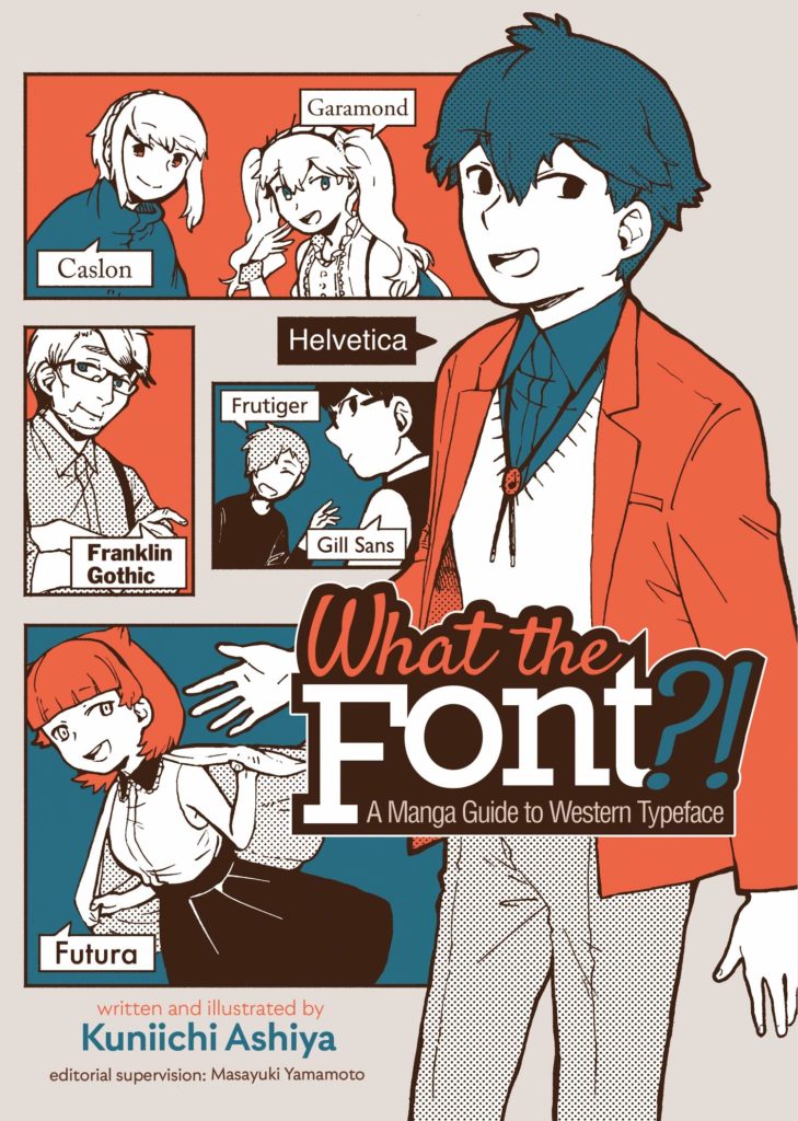
What The Font?! – A Manga Guide to Western Typeface
となりのヘルベチカ マンガでわかる欧文フォントの世界
(My Neighbor Helvetica)
By Kunichi Ashiya
Editorial Supervision by Masayuki Yamamoto
Translated by Jocelyne Allen
Lettering by Karis Page, Interior Design by Clay Gardner
00:00: You should be able to tell pretty quickly that this week Christopher is using a brand new microphone setup. Christopher would like to thank his friend Mike Stafford, who donated a Focusrite Scarlett to him to do the show, which lets him use a pro microphone through USB. Stafford runs the instagram @discogsandchill, with pictures from his record collection (2k+), music recommendations, and playlists! Perfect for the music lover out there looking for a cool insta to add to their feed. Thanks again to Mike for the donation, please go check out his stuff!
2:17: ‘Mammasplaining’ is not coming your way any time soon.
3:20: Yon-koma, or 4-koma (‘yon’ is one of the ways you say ‘4’ in Japanese), is the Japanese equivalent of the daily newspaper comic strip. It’s a 4-panel comic, vertical instead of horizontal, a very popular format in Japan that tends to be more-rarely exported to North America.
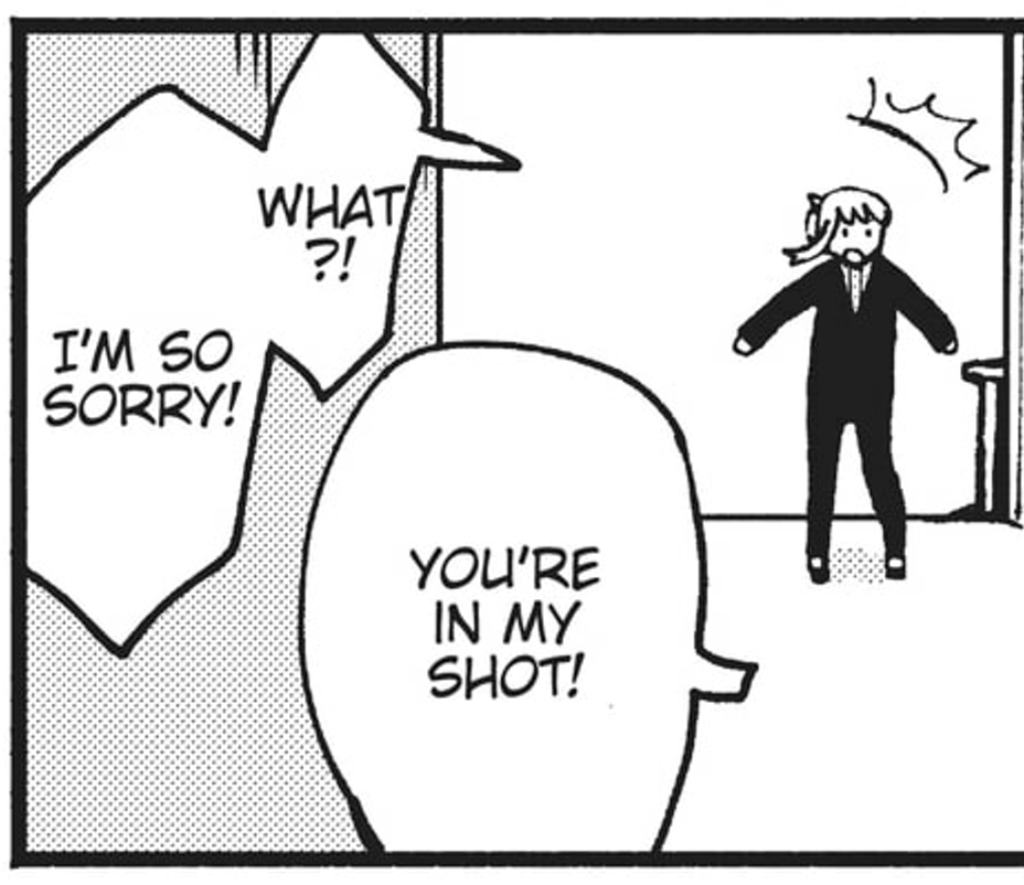
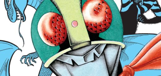
Here’s an example of what a typical page of What The Font?! looks like:
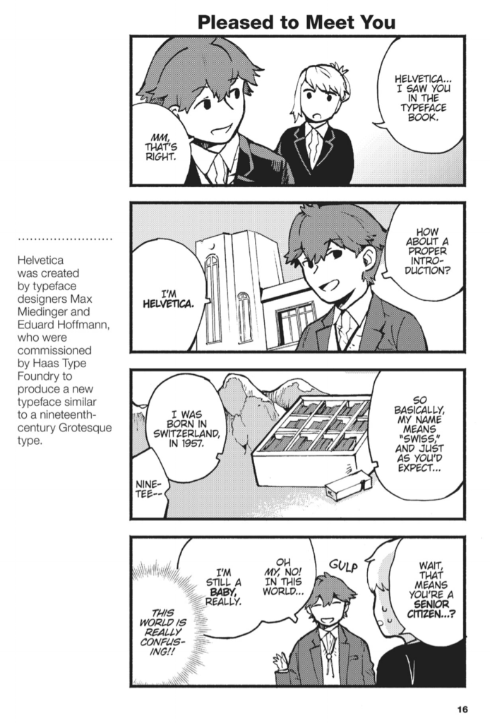
5:00: We talk about the fonts, back and forth here, we can’t gloss them. Sorry! You either know (and/or read the manga) or you don’t. We’ll provide reference where we can.
5:15: Hetalia. Wow. Where to start. Hetalia is a Japanese webcomic begun in 2006 by Hidekaz Himaruya, later adapted into a full manga, a sequel manga, and numerous animated series and shorts. It’s a yaoi/boy’s love manga, which is to say it features romantic entanglings between the characters, although it’s not explicit in any way in the original works. There are literally thousands of fan-works though that are deeply explicit, so, heads-up if you’re googling this with Safesearch off. Oh, and as mentioned, the characters are all personifications of the Axis powers and Allies of World War II. Italy, Germany, Japan are all characters, USA, UK, France are all characters. It’s a light-hearted comedy, which either softens the core premise to acceptability or actually makes it way, way worse, depending on your POV. It’s an underground satire of global politics that became unironic mainstream (Japanese) popular culture and became weirdly popular around the world. Someone needs to write a thesis paper on this thing if they haven’t already. Anyway, no images, you can Google if you want more.
6:30: Japanese mascot culture is probably a thing you’re familiar with even if you don’t think you are. Basically, the Japanese organizations create mascots for themselves, for specific initiatives, for concepts(!), for… everything. It’s great. Unfortunately all the articles I could find about this phenomenon are either behind a paywall or trade so heavily on the Weird Japan trope that they kinda sucked. So you can check out Wikipedia I guess. 😉
6:45: Christopher mentions Doujinshi and Comiket.
Doujinshi (doe-jin-she) are fan-produced, self-published comics. They tend to be printed and presented to a much higher print quality and than North American self-published books, and due to Japan’s urban population density doujinshi events, sort of like comic book or small press festivals, tend to be 10 to 100 times the size in Japan as elsewhere in the world, with significantly more books printed and sold. A ‘minimum order’ for printed doujinshi tends to be around 100 books in Japan, for example, and the average sold by an established indie artist at an event tends to be in the 200-500 copy range for a new title. It’s a big deal!
Doujinshi tend to be either ‘fan works,’ which is to say works based on existing IP from anime, manga, video games, etc., sort of like parody or tribute works, or ‘original’ works, which as the name implies are stories cut from whole cloth. Generally for fan works, companies look the other way when it comes to enforcing their IP rights because fan works only sell a couple hundred or couple thousand copies, and the doujinshi circuit is where many (most?) artists cut their teeth before going to work for big companies. However, some artists stay on the doujinshi circuit forever, not wanting the strict working conditions of working for a major publisher, and happily making (and selling) thousands of books at events, not to mention the various online/digital avenues now available to them.
So about those events. Comiket is a portmanteau of Comic Market, the name of Japan’s largest comics event, topping 300,000 attendees per event (some say it’s closer to 600,000 per event, making it the largest comics event in the world by far). Held twice annually (summer and winter) in the Odaiba area of Tokyo, Comiket features thousands of artists selling their doujinshi over 3-4 days. Comiket is the big one, but make no mistake, across the country there are anywhere between 4 and 10 comics events happening every single weekend, many many more than anywhere else in the world. Or, at least there were before COVID. Who knows the future holds there, eh?
7:05: The Pepsi can and the Coke can are doing each other in this doujinshi. I could not find reference images online. Sorry/you’re welcome.
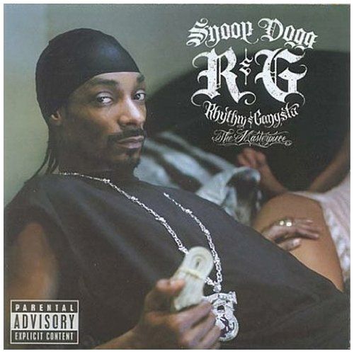
8:10: Chip is the writer of Daredevil for Marvel Comics. He also designed the logo for Mangasplaining.
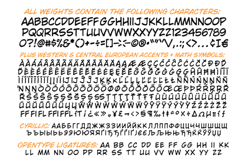
8:50: Blambot and Comicraft are two font companies (called Foundries) that specialize in producing comic book style fonts, and that are often used in comic books.
Blambot: https://blambot.com/
Comicraft: https://www.comicbookfonts.com/
11:45: Maybe it is a reference book? The references here are numerous and dense.
14:45: More about the font Mistral’s use in the film Drive.
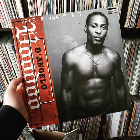
15:10: Fette uz Fraktur is that ornate German-style lettering, and inspired a bunch of other derivative fonts, so lots of this style of lettering can be found on album covers.
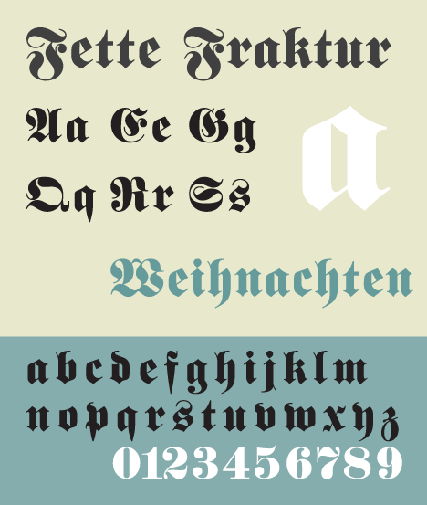
Here are two very good examples:
16:30: Oh no it’s Comic Sans. THE REVEAL:
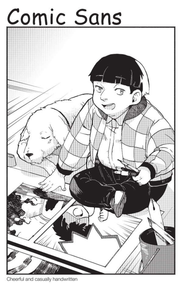
17:00: Christopher says: WELL THAT WENT NOWHERE. Thought it would be a good joke. Sorry about that, we edited out 2 more minutes of technical futzing, but left this part in. If we ever do a video version it’ll make more sense. But yeah, I basically thought Comic Sans was going to be a loud and angry child scrawling all over everything and not giving a shit, just like the vine WHAT’S UP FUCKERS (as seen below). Turns out: Not quite.
What can I say, I had a different mental image of how obnoxious Comic Sans is…
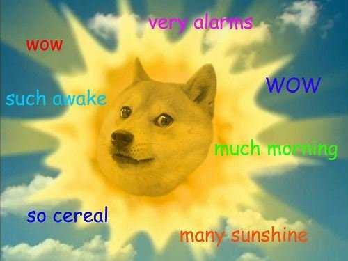
17:35: …which is not to say that it’s not loveable as well, in the right context. Like on these doge memes.
19:20: The Achewood Comic Sans Strip
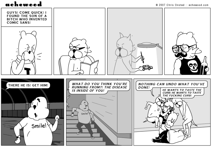
Upon reflection, that character does not look entirely dissimilar to the version of Comic Sans that appears in What The Font?!.
20:30: The word balloon font is what we’re talking about here, and page 134, and then another a few pages later, are pretty egregious examples.
22:40: Christopher says: Specifically talking about the work of Akino Kondoh here. I lettered this story and basically just needed to have some text run vertically. I don’t know if I’d make the same choice today, and frankly I see things to criticize here too. But… https://www.wordswithoutborders.org/graphic-lit/ladybirds-requiem
24:00: Closer by Antony Johnston and Mike Norton, published by Oni Press. Couldn’t find a lettering example unfortunately!
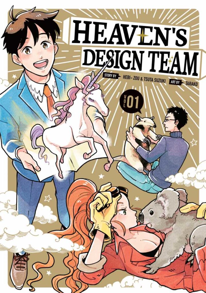
25:15: So Christopher is utterly, completely wrong here… sort of? Author Kuniya Ashiya DID work on a story very similar to Heaven’s Design Team that we mention, and with a similar name, but not that series. Apparently this one is more specifically about extinct animals. You can actually read the whole one-shot in Japanese, legally, on the publisher website: https://comic-zenon.com/episode/10834108156711710292
The art’s a real improvement over this book, which is neat!
26:10: Heaven’s Design Team by Hebi-Zou, Tsuta Suzuki, and Tarako. Published by Kodansha.
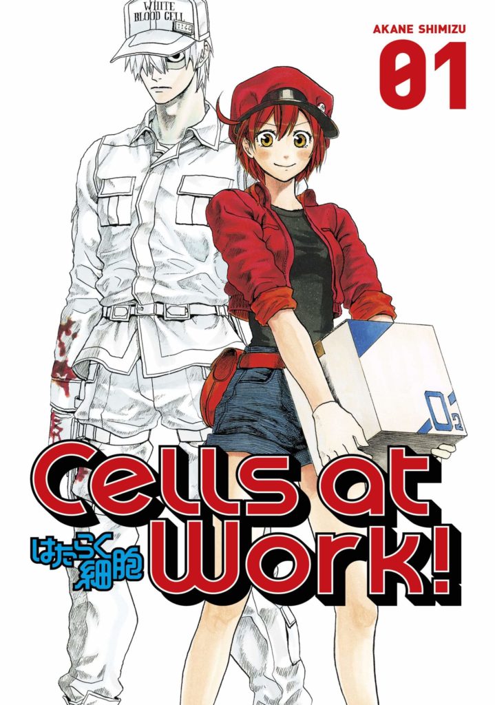
27:05: Cells at Work by Akane Shimizu. Less of a collection of comic strips and more of an ongoing series. VERY popular, it even got an anime, a spin-off manga, a spin-off anime, and then like a ton of other spin-offs. It’s almost like an American comic series; it got successful and then got a million spin-offs milking the original premise. Published in English by Kodansha. Wikipedia Link: https://en.wikipedia.org/wiki/Cells_at_Work!
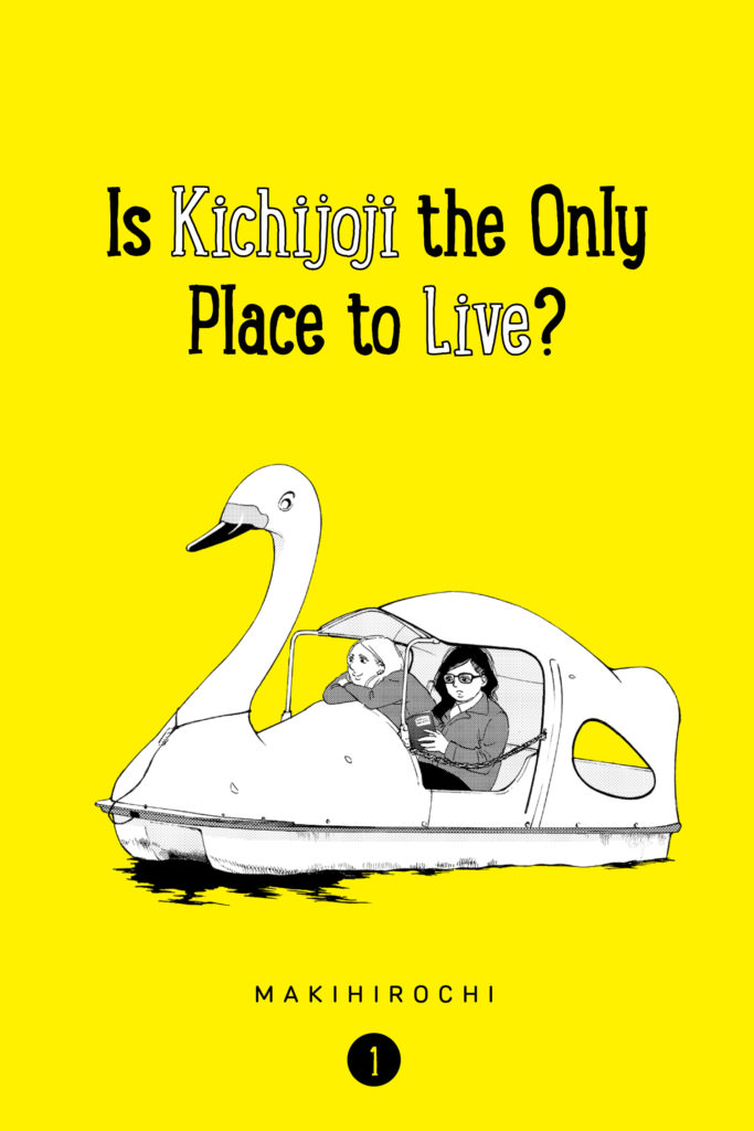
30:00: Is Kichijoji The Only Place to Live?, by Makihirochi, published by Kodansha. It’s a great little manga. *That’s a Manga!
31:00: I guess we didn’t edit it out. Please pay us 10% if you make this manga.
33:20: You don’t watch Font YouTube? Start here:
There’s literally dozens more videos.
34:00: CCWildwords is a font created by Comicraft, as referenced above.
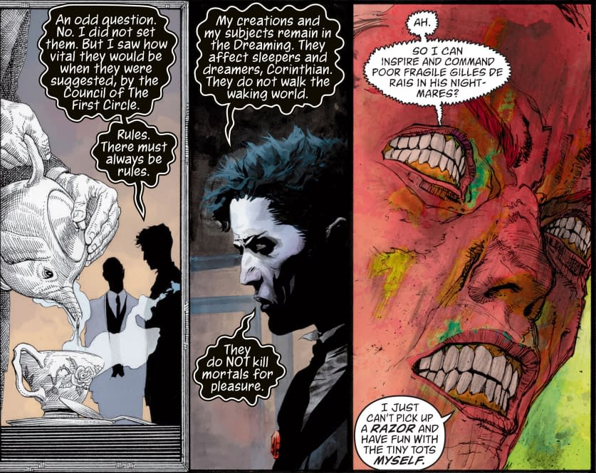
34:20: Like Todd Klein on a Vertigo book. Todd Klein is a letterer most closely associated with his work on Neil Gaiman’s The Sandman for Vertigo, a now-defunct imprint of DC Comics. His work was distinctive for giving unique fonts to many of the individual characters in the book to add a layer of depth to their characters. He usually wins the Will Eisner Comic Industry Award for best letterer.
34:40: An example of the Shonen Jump lettering style, from My Hero Academia chapter 1, by Kohei Horikoshi.
34:50: Christopher is being cheeky here, mixed-case lettering has been around here and there for a long well, but on mainstream Marvel Comics the trend started with books by Brian Michael Bendis, around the time of his work on Ultimate Spider-Man in the early 2000s. Here’s a whole discussion on lettering uppercase versus lowercase in superhero comics by professional letterers, if you’re interested.
http://www.balloontales.com/lettering-roundtable-the-case-regarding-upper-lower-case-lettering/
37:20: The Mangasplaining Bump! That means y’all should run out and buy this book. Our friends at The Beguiling in Toronto are well-stocked and will ship it to you. Scroll down on the front page: https://www.beguilingbooks.com/
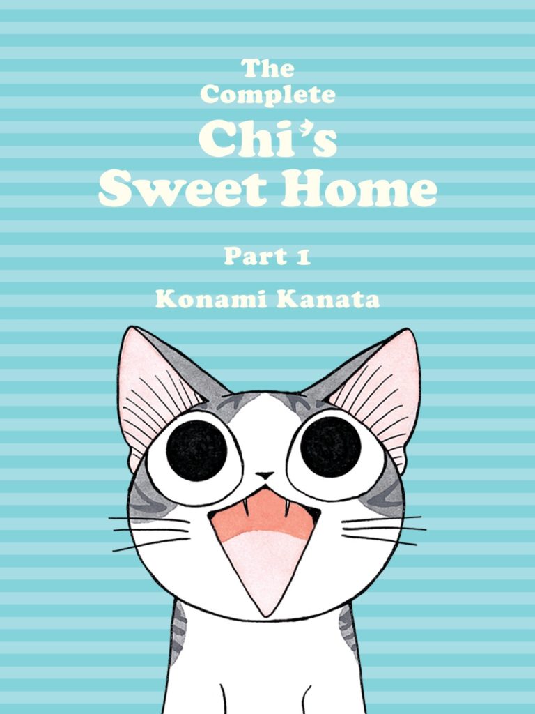
39:45: Deb references Chi’s Sweet Home, by Kanata Konami. Published by Kodansha/Vertical.
41:20: This is insider baseball talk, but the distributor is the company that takes the books from the publisher, warehouses them, and supplies them to retailers.
42:30: Taschen is probably the most popular publisher of art books in the world. You’re probably aware of them, but just in case: The Taschen Website. https://www.taschen.com/
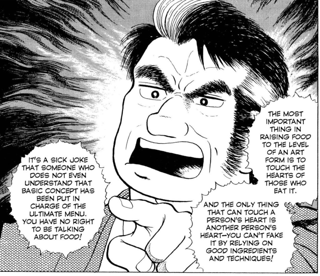
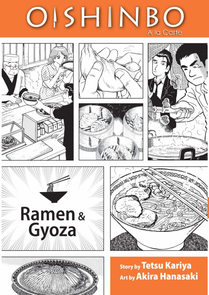
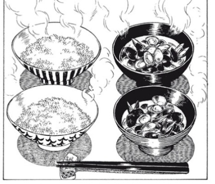
43:20: Oishinbo is a manga series by Tetsu Kariya and Akira Hanasaki published by VIZ Media. It numbers over 100 volumes in Japan and has been running for decades. The English edition features 7 themed volumes, each of them collecting a number of chapters on different subjects within Japanese cuisine. We’re actually going to cover this on a future episode!
45:00: Sadly the Toronto Cookbook store is no more. Even before COVID-19. Bummer. Support the stores you can, while they’re here. Speaking of…
Indiebound – Find Indie book stores near you
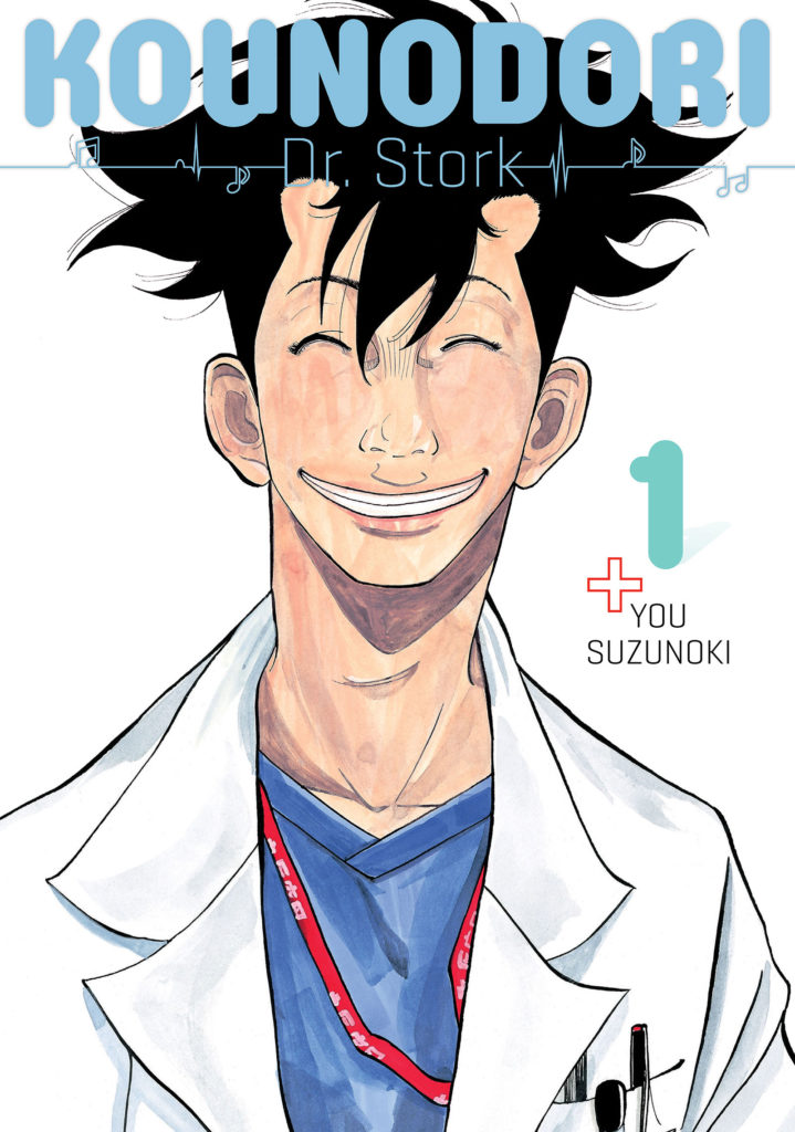
46:08: That manga again is Kounodori: Dr. Stork, a manga about an Ob-gyn, by You Suzunoki, published digitally by Kodansha.
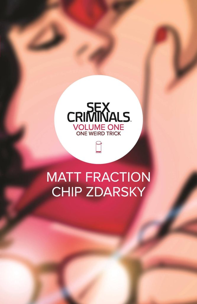
48:00: Sex Criminals, which we’ve referenced a few times, is co-created by Chip Zdarsky and Matt Fraction. It’s very good! Go get it. https://imagecomics.com/comics/series/sex-criminals
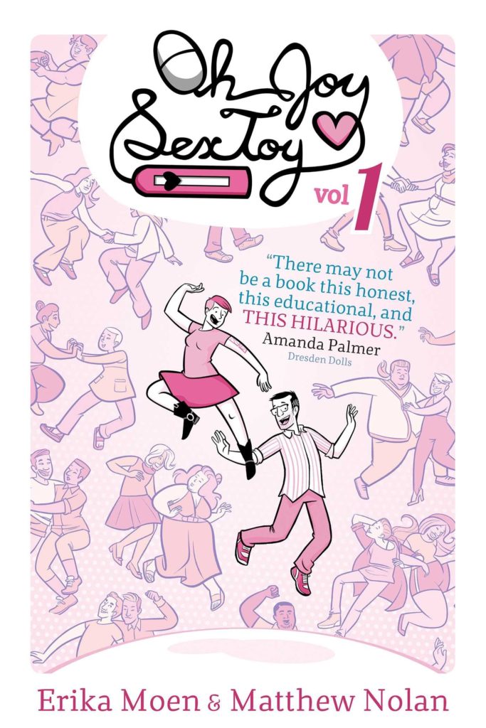
48:15: Oh Joy Sex Toy is a guide to sex and sexuality by Erika Moen and Matthew Nolan, self-published and distributed by Oni Press. They’ve also created the series Drawn to Sex for Oni/Limmerence. Their forthcoming book is for teens and is about sexual health and sexuality. It’s called Let’s Talk About It, and it’s now available from Random House Graphic.
49:00: We already mentioned Oishinbo but here’s that cover since we’re talking about it.
55:20: So here we go! We’re talking about the books that are coming next! The reading order for the next batch of episodes are:
Ep. 6: Wave, Listen To Me! Vol 1, by Hiroaki Samura. Published by Kodansha (Mar 23)
Ep. 7: Yotsuba Vol 1, by Kiyohiko Azuma. Published by Yen Press (Mar 30)
Ep. 8: Way of the Househusband, by Kousuke Oono. Published by VIZ Media. (Apr 6)
Ep. 9: 7 Billion Needles Vols 1-4, by Nobuaki Tadano. Published by Vertical Inc. (Apr 13)
Ep. 10: Tekkon Kinkreet, by Taiyo Matsumoto. Published by VIZ Media. (Apr 20)
Ep. 11: Fullmetal Alchemist, by Hiromu Arakawa. Published by VIZ Media. (Apr 27)
Ep. 12: Oishinbo, by Tetsu Kariya and Akira Hanasaki. Published by VIZ Media. (May 4)
Ep. 13: Beastars, Vol 1, by Paru Itagaki. Published by VIZ Media. (May 11)
1:02:45: It’s time for shoutouts! It’s tough as usual!
Chip sadly shouts-out nothing, apparently.
David shouts out the television series The Expanse, available on Amazon Prime. Everyone loves this series.
Wikipedia: https://en.wikipedia.org/wiki/The_Expanse_(TV_series)
Christopher shouts out the work of Tim Rogers, and his YouTube channel Action Button. https://www.youtube.com/channel/UCjKSoJlPgcK6BmoSqXpj5xQ
Christopher is also very sorry that he’s started being a podcast host with other people but while in the style of Tim Rogers, because that doesn’t really work. Maybe if he starts a solo-podcast. Anyway, gomen nasai, this is a learning process.
Deb shouts out Kodansha’s ‘the first taste is free’ manga offerings, specifically Tokyo Revengers, a bad-ass-punks manga about a 20-something loser trying to save his ex-girlfriend from middle school by going back in time to try to prevent tragedy by joining the gang responsible for her death. It’s currently one of the top-selling manga in Japan now, compounded by the debut of the anime series (which is now streaming on Crunchyroll).
…and that’s it for this episode of Mangasplaining!
Those links again are:
Comicshoplocator.com
D.A.D.S. on Spotify
Thanks for listening!
Another great episode. I’ve got “What the Font?!” here to read and now I’m very motivated. ^_^
I think “Girls’ Last Tour” would be an interesting series to try. Blame! could also be a unique read
A quick search on Google Scholar shows that there are a few academic papers out there on Hetalia. Most of them are paywalled, but contact your local library if you want help accessing them. : )
Hah, thanks for the recommendation, Matthew!
Wow, I wondered how you were going to approach this episode, and at the beginning it seemed you all broached the title trepidatiously until you found your footing. I think the tangents a book about fonts led you to were great as well. I haven’t had a chance to check out the book yet myself, but can’t wait to pick it up. I really enjoyed hearing everyone’s take on the potential in selling manga beyond traditional methods. I gotta say, the tangents were just as good as the main discussion.
Chris, I have to say, I really appreciate the work you put into the show notes. More than mere recaps, they’re quite informative and additive to the whole experience. I can imagine it’s a lot of work not only doing research for the episode, but also putting together these notes every time.
Hey thanks so much, that’s very kind. I enjoy doing the show notes but they are a lot of work, glad someone’s reading and appreciating them!
I had a rough time getting through this manga but I’m glad to hear everyone talk about how important fonts are to convey a message in the realm of manga as well as other industries. I made myself not listen to the full episode until I got through this book and while it is a lot of information, a reference book in comic form is what this is. I hope students who are studying can use this as one of the simplified versions of off reading…supplementary textbooks.